We’re back with our second logo from the Red Branch Media vault! This logo was our rebrand we created for the Seattle-based consultancy ran by Lindsay Colitses. Windridge offers services such as behavioral assessments, skills assessments, employee development and Winslow certification. Lindsay came to us with hopes of creating a new website and logo to stand out and be presented in a modern and professional light. We worked with her to deliver her a top-notch website and logo that reflected this.
Check out the website we created for Windridge, here!
“From the information gathering at the start, to the design and graphics they came up with, to their quick response times, and that each person on their team “got” exactly what I wanted in a website – excellent all the way around!” – Lindsay Colitses, Windridge Consulting LLC (@windridge)
What They Wanted
We took some calls with Lindsay to develop a plan of action for her Windridge logo. Some of the key highlights that we took into account were:
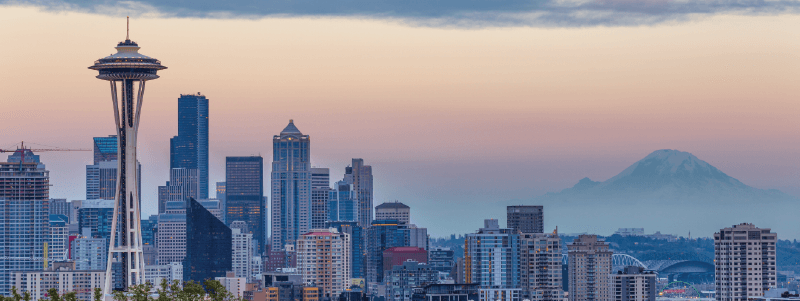
- Trying some iterations that feature Mt. Rainier – a key landmark of Seattle; her company’s location
- Making sure to use a serif font to portray established professionalism, though she was open to a few other options
- Making sure we feature her tagline, “Identify. Develop. Retain.”
- Making sure to feature a dark blue and gray palette, though she was open to trying a few other options as well
After we gathered all of the necessary information we needed, we were ready to move into the design and development stages. These stages usually include 3 rounds of logo boards, refining and getting closer to the final end product with each passing round and incorporating client feedback into each board.
Check out the latest featured #logo from the @RedBranch vault featuring @Windridge: Click To Tweet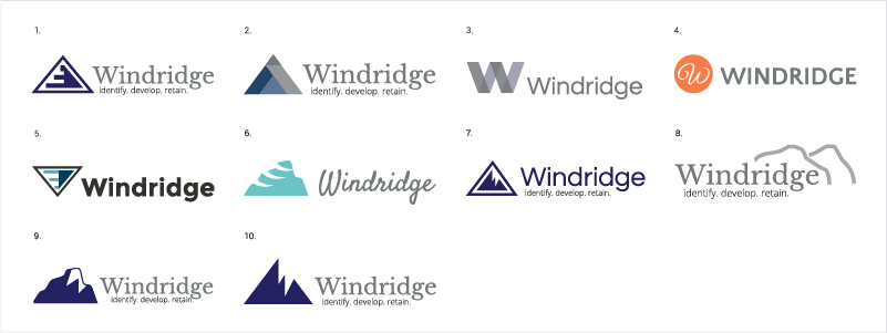
What We Created
The information we received gave us such a great direction to execute this logo. Above, you’ll see the collective array of all of the logos we created as we progressed through the logo rounds. We made sure to incorporate Mt. Rainier in all of the logos – while trying out a literal refresh of her logo with a new orange color in logo #4 above. We also made sure to feature mainly dark blue and gray palettes as requested, and showed a few logos without a tagline so Lindsay could get an idea of how her logo would look and feel without it so she could make the best decision possible as we progressed through the 3 rounds of logo boards. We also made sure to feature mainly serif fonts to stick to a more professional vibe for her brand.
#DYK it takes 3 rounds of logo boards and feedback for the @RedBranch design team to finish a logo? Click To Tweet
Their Decision
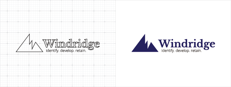
As we moved closer to the end product, Lindsay chose logo #10. This was one of our favorite logos because we designed the negative space to both represent snow on the peak of Mt. Rainier and to display a subliminal “W” that represents Windridge. Another feature Lindsay loved about this logo was that it featured her favorite professional serif font – Baskerville, next to a complimentary sans serif as her tagline. What makes this a strong logo is the contrast between the minimal logomark (the design term for the icon of a logo) next to the refined serif font. Together, this logo represents a modern yet professional consultancy; the exact representation of the brand Lindsay asked for when we first took her call.
This logo rebrand went incredibly smooth. From gathering all the necessary information to making the logo come to life, we couldn’t have gotten it any closer to what Lindsay Colitses of Windridge asked for. Enjoyed reading about this rebrand?
Subscribe to our newsletter and watch your inbox to get your next logo rebrand story, straight to your inbox! We’re showcasing our best and most stunning logos each month, so you don’t want to miss out.
Curious to see our first logo rebrand from the RBM vault? Check out the work we did for FIG, here!

Related Posts
 6 Minute Read
Awesome Illustrator Tools to Use in 2023
10 Minute ReadHow to Make the Best InDesign eBook Template for Your Company
14 Minute Read