Did the new Power Rangers movie get you pumped up too? Well let me make sure you do by watching this badass trailer featuring the original theme song (you can never go wrong with metal guitar riffs). Being a Power Rangers fan since I was little, I was inspired by the metal logo of the new Power Rangers movie and decided to show you how to make and apply basic 3D textures to any word or logotype in Adobe Illustrator! Keep reading to learn how. You might just have a client who requests this texture for their logo, so let’s get learning!

Step 1: Pick a Font and Convert it to a 3D Object
For my follow-along instructional images, I’ll be using the Red Branch Media logo, but you can use any text, font or your own logo. Once you have your word ready, convert it to outlines and let’s get it changed into to a metal gray. For this tutorial we’ll use the hex #CDCFD0. After you change it to gray, click on Effect from the top menu bar, and select 3D > Extrude & Bevel. You can change these settings to get the angle and extrude amount you want, but for the tutorial we will use 7º for the X-axis (the first box), 7º for the Y-axis (the second box) and 0º for the Z-axis (the third box). Go ahead and leave Perspective at 0º and set the Extrude Depth to 50 pt, Cap to the first setting (called, Turn cap on for solid appearance), the Bevel to None and the Surface to Plastic Shading. Hit OK and you’ll have a 3D object!
“These days, there is a big movement towards 3D logos, which has brought a whole new dimension to logo design.” – Pixellogo (@Pixellogo)
#DYK there’s a big movement towards 3D #logos? Learn how to make them in this #design101 #tutorial! Click To Tweet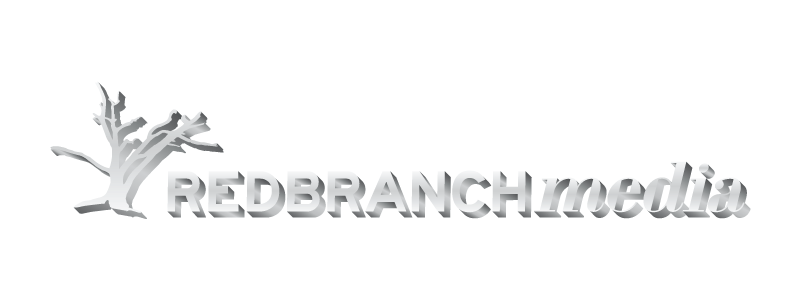
Step 2: Clean Up & Applying Gradients
Now we’ll need to clean this up. First, expand the 3D object by clicking on Object from the top menu bar, and then Expand Appearance. You’ll notice that if you click on your object, the 3D shadow will look pretty jagged and cut up into sections. This is where we will clean. Ungroup each letter by clicking Object from the top menu bar, and then Ungroup. Do this for each letter multiple times so it’s fully ungrouped. Now, click on each flat letter (the original text letters) and lock them by clicking Object from the top menu bar, and then clicking Lock > Selection. Once all of your flat top layer letters are locked, move to the first letter and select all of the pieces under it by dragging a rectangle over it with your Selection Tool and grouping it by selecting Object from the top menu bar and hitting Group. Now click Window from the top menu bar and click on Pathfinder. You’ll convert this into 1 shape by clicking on your group object and hitting the Unite option in the Pathfinder window. Repeat this step for all of your letters and when you’re done, unlock them all by selecting Object from the top menu bar and hitting Unlock All. During this process, some of your united shadow shapes may move above your flat letters. To fix this, simply click on Object from the top menu bar and click on Arrange > Send to Back to move it back to it’s original location.
Flat Letter Gradients
Now it’s time to add gradients. Select all of your flat letters and group them as you learned above. Now, click on Window from the top menu bar and select Gradient. With the gradient window open, click on the gradient fill and keep the Type as Linear. Change the angle to -90º. Now click right underneath the middle of the gradient bar to add a swatch. Double click the first swatch on the far left, select RGB from the top right icon in this window, and for the hex type in #F4F4F4. Double click the second (middle) swatch and change it to the hex #CDCFD0. Now, double click on the third swatch and change it to the hex #F4F4F4.
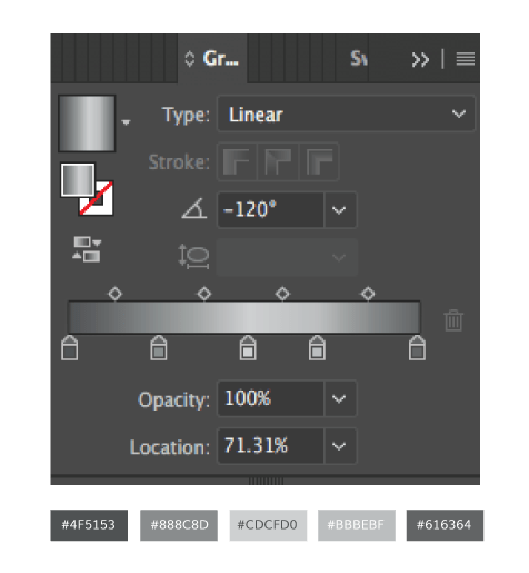
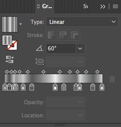
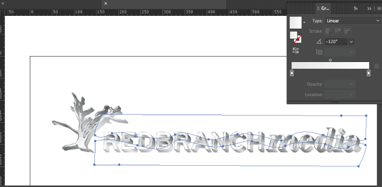
Shadow Gradients
Select all shadows for each letter at once and group them. Open up the gradient panel again, and select the linear gradient and apply a -120º angle. Now, add 3 more swatches and arrange them and change them to the proper hex numbers as you can see from the image above.
Step 3: Adding the Final Bevel & Glares
You’re almost there, and trust me this will look awesome. Let’s add the final bevel. Click on the flat letter group, open up the 3D Extrude & Bevel Options again. Type in 0º for each axis box, leave it at 50 pt for the Extrude Depth, keep the Cap at the same first setting and for Bevel, change it to Classic with a Height of 1 or 2 pt. Keep the second icon selected that appears after the Height option, and change the Surface to No Shading. Make sure to keep the Preview box checked – you don’t want too thick of a border that the Height option makes. If it looks too small, add a few points, if it looks to big decrease a few points. Now, expand this group and then ungroup each letter like you did for the first bevel shadow. Once everything is ungrouped, go ahead and lock all the flat letters & shadow pieces (leaving the beveled pieces unlocked). Now, go through and select all beveled pieces of each letter and unite them with the pathfinder as you did previously with the shadow pieces. Finally, select all your united beveled pieces and group them, select the eyedropper tool and grab the colors from the shadow piece group. Almost done! From here, go into the Gradient panel, set the angle to 60º and add some more light and dark grays and spread them out. Add as many as you’d like, watching your letters as you add swatches to get your desired result like I have below.
Finishing Touches with Glares
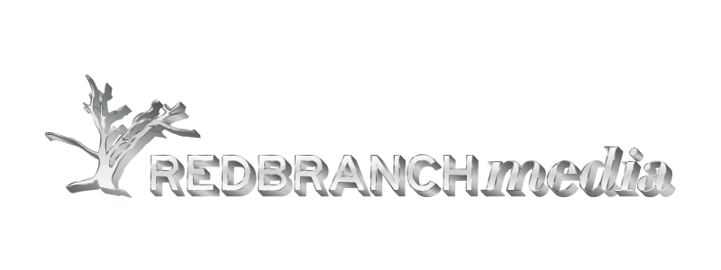
It looks awesome right now, but these glares will be the icing on the cake. These are actually very simple and easy to make. First, draw a wavy line going across the bottom 1/3 of your letters and then close the shape by drawing a line under the wave (see below). Next, do the same thing for the top 1/3 of your letters. Once you have both shapes complete, select both waves and open the Gradients panel and click on the linear gradient. Now, set both swatches to white – making the left swatch have 0% opacity and the right swatch have 90% opacity and change the angle to -120º. While these 2 waves are still selected, change the overall shape opacity (located at the top) to 75% and group them. Now, select the flat letter group, make a copy and select Edit from the top menu bar and click on Paste in Place. Ungroup these letters, select your first letter and bring it to the front by clicking on Object from the top menu bar, then selecting Arrange > Bring to Front. Now, select your waves and your letter and click Object from the top menu bar, then select Clipping Mask > Make. Now your glare has been cut to fit inside the letter! Now hit Paste in Place to repaste your wave object exactly where it was, and repeat this for each letter until all letters are masked. That’s it, you’re done! For an added effect, throw this on a dark and/or textured background.
 Want to make a #3D, metal #logo? Check out @RedBranch’s latest edition of #design101 to learn how! Click To Tweet
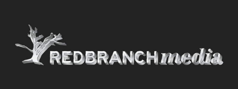
Making any special texture and applying it to a logo might take some time and work, but it never fails to pay off in the end. Textures like metal make logos more unique and complex. Don’t forget about this new skill you’ve acquired, because I can practically guarantee you’ll need to use it in the future (I’ve made 2 metal logos in my career so far). Plus, it’s a great trick you can use to impress your friends! To expand this skill even further to better understand how the metal texture uses gradients, go back into your shapes and groups and change the gradient colors — for example, try changing your text from metal to gold (using yellow hues) or bronze (using reddish brown hues).

Related Posts
 6 Minute Read
Awesome Illustrator Tools to Use in 2023
10 Minute ReadHow to Make the Best InDesign eBook Template for Your Company
14 Minute Read