A website is essential to doing business in the digital age, but it’s often not enough. Sometimes, there’s no room in the budget for a full redesign or you want to create a space for a specific audience.
Enter landing pages. An incredible marketing tool that sits at the heart of marketing automation, landing pages help businesses promote events, sell or give away downloads and goods and are fundamental when running digital ad campaigns.
As opposed to a full-blown website, a landing page is a single page with a highly specific target meant to push visitors to perform a certain task. Those tasks can range from subscribing to a newsletter, purchasing items in an online store, downloading content and much more. In most cases, landing pages are perfect for setting up opportunities to grab leads and provide downloads.
So what are some great to remember when making landing pages?
- Make it very clear what you want your visitor to do
- Know that less links are less distractions
- Reinforce the Call To Action
- Include multiple ways to learn about the company
- Start with a simple question, then lead to your product
- Appear to come from a local source
- Use click triggers near your CTA
- Uniquely tailor your mobile LP
- Don’t forget about a Thank You page.
1) Make it very clear what is supposed to be pressed
This change can be a subtle one. Potential clients are automatically looking for a button. If they are not provided with an obvious one soon after arriving on your page or reading the content, they aren’t going to chase and may move on.
Depending on the page, you can increase clicks without a button square but keeping the text. In this example from Leadpages, the opt-in rate increased by 35.69% after removing the CTA button and keeping the text to catch the reader’s eye.
2) The fewer links you have, the fewer distractions there are.
Oli Gardner of Unbounce defines attention ratio as:
“The ratio of links on a landing page to the number of campaign conversion goals. In an optimized campaign, your attention ratio should be 1:1. Because every campaign has one goal, every corresponding landing page should have only one call to action – one place to click.”
This means no extra footer links or clickable content other than the CTA.
An Unbounce LP went from a 10:1 to a healthy 1:1 attention ratio and increased CTR by 31% simply by eliminating the footer links.
3) Reinforce the CTA
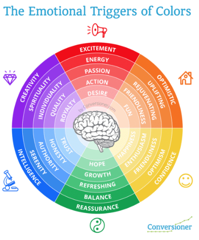
Consider the colors you’re using and what emotions they evoke. While you’re at it, what is the general attitude you want your visitor to have? By having someone smiling in a picture, you can create positive feelings with the reader or vice versa. You should always be thinking, “What are the emotions of my page? What are the people in it doing? Do the actions in the page reflect my company and the goal?”

4) Include multiple avenues to your product
Don’t rely on your landing page to gain clicks or leads. Pop up boxes with questions or chat boxes to speak with your team is a great way to increase clicks and converse with potential buyers or clients. According to internet retailer, online apparel retailer ScottVest engaged in 160 chats per week all thanks to popup boxes, 25% of which turned into sales.
5) Start with a simple question, lead into your product
It can be intimidating to give out personal information without having built trust with a company. Your landing page might be the first time a buyer is introduced to your business, so it’s important you begin building rapport immediately. One way to do this is by asking for less personal information from the go and relying on future landing pages or interactions to gain more insight.
PPC-obsessed Johnathan Dane explained in a webinar with Unbounce how going from a one-step to four-step form increased conversion rate by 311%.
6) Appear to come from a local source
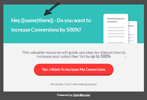
Another great way to build trust and make a landing page more personal to the client is by adding dynamic text replacement (DTR) to the page. DTR creates a familiarity, security and trust with the potential client by speaking to them directly.
DTR can be placed into your headline, sub-header, CTA copy, description, keywords, titles and more.
Here is an example of DTR:

7) Use click triggers near your CTA
Sometimes people just need that little extra push when it comes to clicking the button. Click triggers assist with the decision making. This could be a picture of or quote from the owner or testimonials from clients or users that pertain to the content. Anything that creates positive feelings and assures the visitor you can meet expectations.
On that note, make sure that none of the above invites negative thinking in any way. For example, the word “spam” near your form button, even if trying to ensure your audience that you never spam, will trigger negative thinking. Your visitors weren’t even thinking about spam until you mentioned it.
8) Uniquely tailor your mobile LP
Simply having a responsive landing page does not mean your mobile page is automatically optimized.
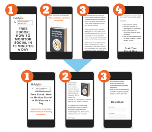
This one is huge. With the increasing amount of people using smartphones and decreasing attention spans, there is room for a lot of improvement when it comes to your mobile presence. Make sure that when someone is viewing your landing page on a mobile phone, there is much less content than the actual website.
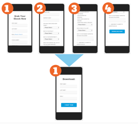
Hubspot’s Lauren Hintz explained how they went through a super thorough testing process to get their mobile page right.
They first worked on simplifying their content and getting their images optimized:

Then they refined their mobile form:

9) Don’t forget your Thank You page.
This is the last chance you may get to snag clicks for other content. You should make a habit to always provide links to your social media pages and other landing pages or products.
This is also where you tell your visitor exactly what to expect, how and when. Will they be receiving follow up? When will they receive the download? Clarity is key to the Thank You page and it should assure the visitor that they did the right thing.
Anyone can make a landing page. There are many themes and templates to help someone do so. The real difference is in the details. Learning to effectively optimize your landing page to increase clicks is an art. Luckily, an art which can be taught. Start with these 9 best practices to increase your click-rates on your landing page and go from there.
Need help on your marketing automation? Red Branch Media does that. In fact, we recently blew past a client’s lead goal by 550% using tactics in this article! Set up a call to find out how we can make you fall in love with your marketing again!


