By Guest Author, Alina Midori
Long ago, in a not so far away place, there was a brand that had nothing exciting to tell. Then, someone learned how to design a logo, and the magic started to unveil.
Good stories don’t always need words. Human imagination can often connect the dots of a story with only a few key elements. For example, think about historical pictures that capture brief moments and tell stories about love, hope, strength, and courage. Well, apply those same elements to your logo! After all, it should express your brand’s personality and identity.
Not every good story needs words. Learn how you can tell your #brand's story through a great #logo here: Share on XWrite a Compelling Story
Let’s first start by identifying what a brand story is. It’s the most significant element you need to make clear when introducing your brand to potential customers; hence, your logo should sum up your core values, and stand for a meaningful story. What story does your logo tell? First, ask yourself the following questions:
- Who is your customer?
- What makes your brand different from your competitors?
- How do you want your customers to feel?
- Can you describe your brand with five words or less?
- If your brand was a person who would it be?
- Where does your brand come from?
Next, write the answers down and start picturing the story about your brand; where does it come from? Where is it heading in the future?
If you’re struggling to get the fundamentals, there are storytelling rules you can apply for writing your story.
- Universality. Great stories happen in a unique situation, but the human condition has always struggled with the same issues and emotions. This means you need to address real feelings to make it relatable and human-centered.
- Clarity. If you don’t know why you’re telling this story, chances are your customers will get lost along the way too. Be passionate about it, but also be clear to where you’re heading and establish a straightforward purpose.
- The surprise factor. In the modern era, stories that shift expectations and challenge our perception of reality are the most successful. Fairytale storylines are somehow dull and fail to surprise anyone.
- Simplicity. People recognize a good story –or logo, for this matter– when they see one. If they have to ask themselves what’s happening with that brand, perhaps the experience won’t be that great. Of course, when creating a good logo, you want to include as much information as possible, but those layers could be distracting, and probably don’t need to be there.
Be aware that writing a compelling story involves a deep understanding of human behavior and emotions, so you should be able to explore this for your brand and your potential customers as well.
Get the Creative Juices Flowing
During the brainstorming process, this is when you need to release your most creative self. If you’re more of a visual person, start by creating a mood board. Here’s how you can do it:
- Set a clear goal. Mood boards follow different purposes; some are used for inspiration, while others tend to be purely practical, almost as if you’re following a set of instructions. Before you start collecting visual items and choosing a color palette, set a project goal you’ll want to tackle after gathering your assets.
- Collect inspiration. Start by adding the written content you previously worked on. If you like, add some quotes or words that could be useful throughout your display.
- Add visual key-elements. These aren’t necessarily logo material, but it can be useful to create one. Don’t be afraid to add in photos and designs from other people for inspirational purposes.
- Choose colors and fonts. Create a color palette that suits your brand. You can build it yourself, choose from online palettes already curated by designers, or use an online color palette generator. Next, choose a font and its different weights to portray how everything would look when it comes together.
In case you’re not into the mood board process, brainstorming can be faster. The most important thing to do is to create an environment that encourages creative thinking, starting with a comfortable, distraction-free space, material for writing things down, and anything that you feel makes brainstorming easier.
Bring paper, color pencils, markers, and other items that help you and other individuals to represent your ideas. When feeling overwhelmed with handling too much information, you can plan different sessions for your brainstorming process, or let the concepts sink in and rethink them later. You should also set a time limit along with measurable goals to help you know when you’ve completed the session.
The number one rule when it comes to brainstorming is never to judge. By not following this rule, you’ll start to second-guess yourself and compromise the session. You must embrace the crazy, weird ideas!
Sketch a Design
For most famous brands, it took some time before their logos became iconic logos, so don’t feel pressured to strike gold right after your first sketch. Good logos, even when they’re simple, take time to develop.
Target, for example, created its logo back in 1962, and it wasn’t until 2006 that the brand removed the text to keep it simple, bold, and on point. Another example is Apple’s logo, which has gone through a lot of changes. They’ve experimented with flat versions, rainbows, and even a chrome version in 2007, which they all kept a minimalistic feel.
Logos that haven’t changed throughout the years and remained relevant are rare. One good example is the Mercedes Benz logo, which is quite simple and has been the same since 1909. The star, however, carries a lot of meaning: the three points represent air, land, and sea, which, in turn, represent the three segments for their automotive industry.
At this point, sketch a simple design based on a key element from your story. Is it a person? An object? An animal? It doesn’t matter if you’re not the most skilled artist in town. The purpose of sketching is to narrow down a few ideas and define an image that will represent your brand.
After doing this a couple of times for different brands, you’ll be a sketching expert, and ideas will come up naturally.
The following are rules to follow before and after creating a logo:
- Is it trendy? If you design your logo to follow a trend, chances are it will be outdated very soon. Many designers opt to create trendy logos that work great for a while, but when the trend dies down, you’ll need to redesign a new logo sooner than later. Don’t get me wrong, it’s absolutely OK to be aware of what’s current, and to know what’s ruling among the universe of design trends. But, make sure you aren’t creating a logo that will look relevant for less than a year.
- Does it work at large and very small scales? It’s indisputable that a good logo should be scalable. When creating a concept for your logo, make sure it looks nice from a distance and over different textures, light conditions, and definitions. A well-designed logo looks great on both large billboards and business cards. If it doesn’t look right under perfectly controlled circumstances, then it’s not a good logo, or it needs some work.
- How does it look in black and white? A logo doesn’t depend on your color palette, and if it’s well-designed, it should work in black and white. Focus on getting a beautiful, recognizable silhouette.
- Is it clever? Not all logos are bright. Some are just plain and simple, and that’s OK. However, if you want to create a logo with a good story behind it, take some time to make it amusing. Take the time to be witty and think about graphic puns that you can subtly add as a visual element.
- Can you draw it from memory? When you finish your logo, show it to a bunch of different people and ask them to draw it from memory. If they fail miserably, your logo may need some additional work. If they craft a somewhat accurate logo, it means future customers will keep it in mind and will identify it quickly.
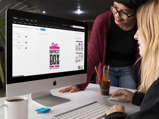
But what if you need to design a logo as soon as possible? You can try online tools like Envato’s or Placeit that allow you to choose from a variety of templates and play with different versions of it.

Create a Strong Logo
Once you’ve sketched your logo, it’s time to make the final version of it. To create a logo that’s strong, unique, and meaningful, you need to know your brand from A to Z. Also, keep in mind a strong logo must be simple, timeless, and relevant.
Highlight the emotional factor of your brand and translate it into a graphic piece, but don’t force it. Accept the limitation of a single visual piece and don’t overburden it with too many elements to explicitly tell a story. It should be a somewhat natural connection between what people see and what they imagine.
If you’re willing to get a killer logo that stands out, choosing one from a ton of templates may be a wise move. Sure, you’ve got serious design skills, so why am I telling you this? Well, you can pick from a variety of already designer-approved logos, and customize the color palette, make some minor changes and get a high-quality final product without spending too much time on this part of the process and focus on the rest of the marketing strategy instead.
Think about Proportion and Symmetry
Can you spot a logo that could’ve been awesome but ended up being disproportionate? Even the pros can still learn some lessons about these design fundamentals. Measuring text boxes, curves, and distances between elements are useful strategies to ensure your logo is visually pleasing.
Negative space is also an essential element when building a logo. It’s not just about the blank space around the strokes and graphics, but something you can add subtly to conjure an idea of another visual element.
Stick to the Basics of Color
Besides coming up with a good design, recognize the value of a color. Design experts always say that specific color schemes affect people mentally and physically, setting a variety of moods, or can catch other people’s attention. These standards are pretty simple; for example, red works for food brands because it stimulates hunger, while blue reflects wellness.
There is science behind the color theory. To quickly explain the meaning of each color, here’s a quick guide:
- Red: It evokes energy. This is a bold, sexy color.
- Black: This one is often used to suggest power and credibility.
- Purple: For spiritual and feminine brands.
- Orange: For creative, youthful brands.
- Yellow: Reflects optimism and originality.
- Green: This color embodies vitality, growth, and of course, nature.
- Blue: Shows tranquility, health, and wellness.
Monochrome graphics, gradients, and hi-tech abstract patterns are some design trends that are making a comeback. If you choose to try one of these out, keep it simple.
Read More: 12 Hilarious GIFs That All Graphic Designers Can Relate To
Try It Out
Before launching any product, your logo included, run some tests to double-check it works well for its purpose. So before getting the final version printed out, you should test your logo’s versatility, and verify it works nicely on different displays. Here are a few tips to know if the latest version is the best fit for your brand:
- Work on various versions of branded content to see what your logo will look like. Take time to test your recently created logo applied to social media content.
- Make sure you adjust your graphics to current formats. Social media specs change regularly, so you should keep track of them and confirm you’re following each platform’s guidelines.
I strongly suggest using an online mockup generator to see how your logo will look like in real-life scenarios, and so it meets your brand’s personality. If you’re working on a logo for a clothing brand, go for apparel mockups. If it’s for a consulting brand, try your logo on business card mockups.

Additionally, your logo will appear on multiple devices. It would help if you thought about how your logo will look on paper and electronic media as well. Colors and shapes should look well on CMYK (print) and RGB (light). Perhaps you should stay away from odd colors such as dark browns, opaque greens, and certain shades of yellow.
Unleash the Power of a Great Logo
Branding is knowing how to tell a story using color, shapes, and precise words – that’s how famous brand logos have become cult pieces throughout the years. Designers from all over the world have mastered the art of telling their stories through one single visual piece, often seeing beyond fleeting trends and going for timeless pieces.
Even if it’s a compelling piece, don’t expect instant success when revealing your logo. Keep it real and be mindful of the fact this is one of the ways for people to know your brand. Sure, you can be positive about it, but yours will hardly be the next Nike logo if there’s not a strong brand and a good product behind it.
Famous #brand #logos have become cult pieces by knowing how to tell a story using color, shapes, and precise words. The secret to this technique can be found in @Redbranch's new article Share on XBonus: Get Inspired!
If you’ve read this far and still can’t imagine your logo, pick one of these pieces of inspiration to start your logo:
- Text boxes. These are simple logos that focus on words and rely on the power of your brand’s name. The downside is these logos don’t look playful, unless, you have a firm and memorable brand name, your logo won’t mean much.

- Geometric. Circular design logos work excellent for social media profile pictures on Facebook, LinkedIn, and Instagram. Whereas minimal geometric shapes are incredibly versatile and clean, and work for almost all industries.

- Handwritten. This isn’t a new concept –does Coca Cola sound familiar? Using a handwritten style is a classic choice that has outlived many fleeting trends. If you choose one of these, it will incorporate a touch of handmade detail to your branding, and a perfect choice for a small business.

- Illustration. This style is the easiest way to portray a story because you can choose any symbol you’ve already picked from your first storytelling phase. It allows you to be more literal and straightforward.

Read More: Design 101: Surround Yourself With Design
Though I’ve been telling you to create a logo with a meaningful story, don’t sweat it. Yes, there must be a meaning behind it, but it doesn’t need to be a puzzle for people to solve. If it’s too difficult to understand, try taking some elements out or choosing a more basic color palette. Keep in mind your logo is the first and most important introduction to your brand. Therefore it should be well-balanced between deep meaning and great aesthetics.
Your ultimate goal when creating a logo is for your customers to become aware of the meaning behind your beautiful symbol. Ultimately, your logo represents a story about the effort and perseverance you’ve put into your brand.
Are you a designer or a small business owner? Did you find it challenging to come up with a story to support your branding materials? Share your thoughts on creating a logo from scratch. Also, if you’re a pro and have a piece of advice on creating a logo with a story, please share, and we’ll be happily ever after… or at least for the day.
About the Author
Alina Midori; Content Marketer at Placeit, journalist at heart and haiku writer. If her life was a movie, it would probably be a horror movie/chick-flick called I Didn’t Have Coffee This Morning or a book called The Beast Who Hibernated Inside a Hungry Girl.


