In the first part of this series, I talked about how Call of Duty impacts the design community and what makes Black Ops a branding legend. In part two, I will go over how Call of Duty: Black Ops has inspired me and my own design efforts. Can’t imagine a video game can influence graphic design work? Think again:
Did you miss part 1 of this series? Read it here!
Branding & Design
Now that I’ve talked about the marketing side of design with brand identity, it’s time to nerd out and talk classic design. Call of Duty is a war-based game, so the design has to include the same grit, sharpness and intensity war brings with it. As the Black Ops series progresses, so does the setting. Starting in the 1960’s Cold War for Black Ops 1, it jumps to 2025 in Black Ops 2 and 2065 in Black Ops 3. As you can assume, with each setting being further in time, cutting-edge technology environments become more prevalent… and the branding follows.
See what makes Call of Duty: Black Ops a #branding legend: Share on X
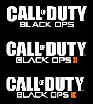
Look at the logo evolution above. Notice how the letters of “Black Ops” simplify and are cut to give it a more futuristic appearance. Even the “Y” of “Duty” and the “A” of “Call” gets a slice in it. The color palette in these games evolve to dark colors, primarily black, white and orange for branding — which is fitting for an evolving future-based war environment. Finally, the fonts in this logo are unique and easily recognizable. The logotype focuses on a tall bold sans-serif font to emphasize the words “Call” and “Duty,” while the word “of” rests nicely in between as a thinner, much smaller sans serif font for contrast.
The words “Black” and “Ops” add to this thin sans serif contrast so the focus is still on “Call” and “Duty,” but is centered underneath so the eyes won’t miss it. When the 2nd and 3rd Call of duty games were produced, they used thick geometric roman numerals, introducing the new, iconic color of this series — orange. Since this color is so bright, it works so well that while people can easily recognize the Call of Duty logo so fast now that it’s been around for so long, the orange element pulls your eyes to it almost immediately so you can recognize that it’s the 2nd or 3rd game in seconds. Brilliant.
How CODBO Influenced & Inspired Me as a Designer
So this brings me to the burning question I’ve been dying to tell you — how has playing and experiencing this video game inspired me in my design work? As I’ve explained earlier, I feel that the logo is brilliant. But more than the logo, the user experience (UX) and user interface (UI) displays some amazing motion graphics and awesomely designed features.
Here are my top favorite motion graphics and design elements from each game (follow the links to get inspired!):
- Call of Duty: Black Ops — Creating/drawing your own emblem. Spewing creativity, this feature of the game was the first time I’ve seen anything like it before in multiplayer. You have artistic freedom to create almost endless possibilities (you’re limited on the shapes you can use by the ones they provide) of a square space that acts like your multiplayer logo, called an “emblem.” This feature has inspired me to always try to make sure everything I design or create still provides some kind of good user experience. Good UX = Memorable Moments.
- Call of Duty: Black Ops 2 — Multiplayer menu screen. This screen is has been so inspirational for me because of how simple and effective it is. Not only does the looping music pump the user up to play competitively, but the subtle motion graphic on this screen still inspires me to this day. If you look closely, you’ll realize that this photo is actually multi-layered, with smoke that subtly moves between each of these characters/players in the photo. Minimal, but amazing.
- Call of Duty: Black Ops 3 — After action reports. Who doesn’t love well-designed reporting animations? Not only do you get to keep track of your scores in real time during gameplay, but after you complete a game you get a nifty and beautifully designed reporting screen that shows you tons of data — from your gameplay data to overall data for all games to date. This reporting screen is so well designed, it has inspired me to design much more visually interesting data such as this Findly/Lighthouse Research & Advisory infographic!
Bottom line, branding is in everything these days. It has evolved into an integral part of any existing product. Sure you could look to Apple, Amazon or Starbucks as a shining example of branding done right, but there are other legends out there like Call of Duty who deserve a spotlight. I mean a stellar brand identity that has pulled in $10+ billion with cutting-edge design is legendary to me. The key takeaway I have for you is this: good branding can make nearly anything memorable. How epic is that?


