By Kerry Pivovar:
This is B2B. We aren’t selling jeans or face masks. We are selling expensive software and comprehensive services meant specifically for other businesses and corporations to buy and use. The main function of a B2B website is to explain what is being sold, why we are selling it and how to buy or subscribe. Enacting these best practices of B2B websites will ensure your site has the formula to sell.
Does your #B2B website follow these 5 commandments? Turn your digital presence into a selling machine. Share on XDoes your website follow these 5 commandments?
I. Thou Shall Not Over Design
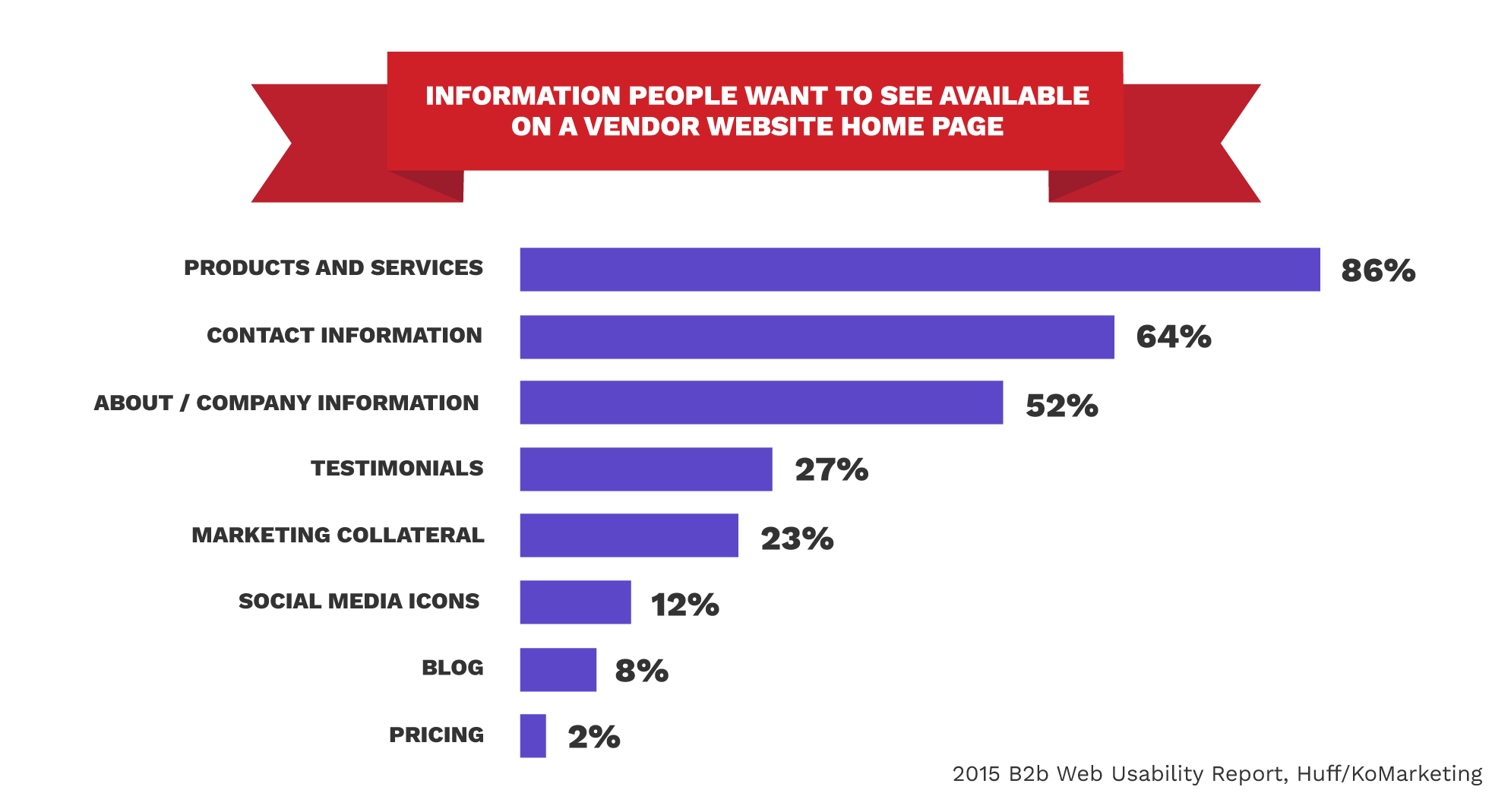
I appreciate a pretty page, I do. And sites should be aesthetically pleasing. But if I can’t figure out the navigation or am confused by an abnormal scroll, chances are I’m going to get lost or frustrated. If a website is designed like a Picasso, users might stay for a laugh but will probably leave without a purchase. The most important factor in the graphic design of a website is ensuring your potential buyer will find the information they need to make a positive assessment of your company. Keep the design simple, clean and inviting and remember that your homepage is your first impression. In fact, 86% of visitors who land on a company’s website homepage say they want to see information about the company’s products and services.
 II. Thou Shall be Mobile Responsive
It’s almost 2020, so I’m sure we’re past this issue, right? Wrong. Although the B2B marketplace is thought to be happening ‘at work on desktops during work hours,’ 40% of smartphone and tablet owners search for B2B products on those devices. Remember, the way people work is morphing to become more mobile. Potential purchasers will vet your offerings on their phones while on their commute, or at a conference or during lunch. B2B marketers need to understand a mobile presence is just as important to a B2B customer as a B2C.
Not sold yet? Well, then Google may persuade you. Google prioritizes mobile-friendly websites over those that are not in mobile search results. The 2015 Google algorithm change tweaked the way Google displays mobile search results, so websites that are optimized for mobile rank better than those that don’t.
III. Thou Shall Aim to Sell

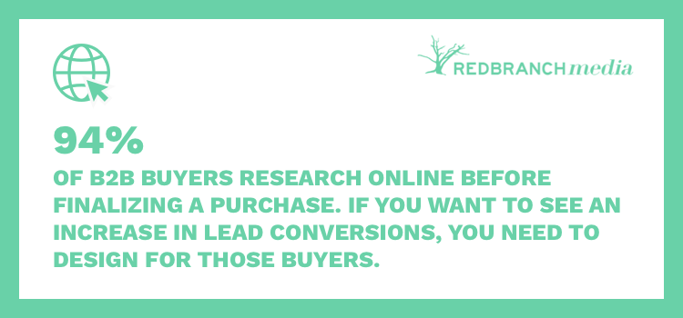
This one is key. Our website isn’t here to change the world. We are here to fill a need in the competitive landscape and directly lead to sales. 94% of B2B buyers research online before finalizing a purchase. Many factors go into this piece from layout to navigation to web copy to forms. And there can be several avenues in which a buyer can go from the awareness stage to the buying stage. But if a user can’t review your product, get a demo or sign up for a free trial in a matter of minutes, you are doing it wrong. In the end, your website needs to be built with marketing in mind.
IV. Thou Shall Put the User First
Who is our target market? What kind of people will be using our site as part of the marketing/sales cycle? What pages do they need to see first? B2B sites ought to emphasize usability more, not less. They must help users accomplish more advanced tasks and research more specialized products. Put yourself in their shoes. If possible, consider building buyer personas to not only inform your site build but also all other marketing materials. Can you easily find clear, concise information about the services and products you’re selling? When in doubt, remove excess and keep it straightforward.
Thou Shall Not Over Design... and other commandments of B2B #websites marketers need to be following. Share on XV. Thou Shall Offer Support
If a user can’t find what they’re looking for OR needs to ask a question, they should be able to locate solutions to either in just a few steps. 51% of people think “thorough contact information” is the most important element missing from many company websites. Effective ways to provide support are help pages, FAQs, submitting tickets, Twitter, phone numbers and chat plugins. A way to contact you should always be readily available in the main navigation, footer and/or a contact page. Having a representative play a supporting role in the buying journey will increase conversion rates by easing any stress or anxiety dealing with a [robot] website may induce.

How Did You Do?
Keeping all five commandments can be a struggle. Google algorithms change, design trends fade and technology continues to advance. The power of a website can make or break your company. Why let it fall to the wayside when there are experts out there who can help? When you’re ready to put your website at the top of your priorities list, give us a call.


