If you’re a graphic designer and you’re starting to branch out into web design, you’ll need to be well equipped with some great direction. More specifically, like learning any new skillset, you’ll need to be well equipped with a great workflow in order to utilize it effectively. As I began web design work myself this summer, I created an effective 3–ingredient web design workflow that ensures great results. Let’s get started!

Ingredient #1: Style Tiles
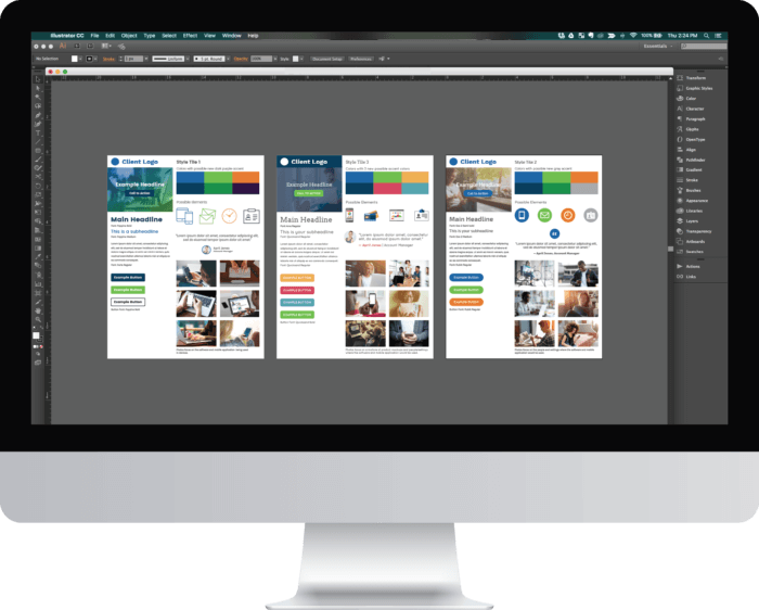
The first ingredient you’ll need in beginning web design are the style tiles. What are style tiles you ask? Plain and simple, they’re a website’s visual brand guidelines. They usually display typical elements you’ll see on websites such as colors, button styles, font choices, a simple header, subheader and body copy layouts, pull quotes, iconography, image styles, etc. To get these glorious blueprints, you’ll first have to find time to speak with your client. A good rule of thumb is to collect information from your client, create 3 different tiles and from their feedback create one final tile that will help you in designing your web pages.
Read more about creating kickass style tiles for your next web project
Once you’ve read up on how to properly create some kickass style tiles, we’ll move on to ingredient #2.

Ingredient #2: Inspirational Sketches
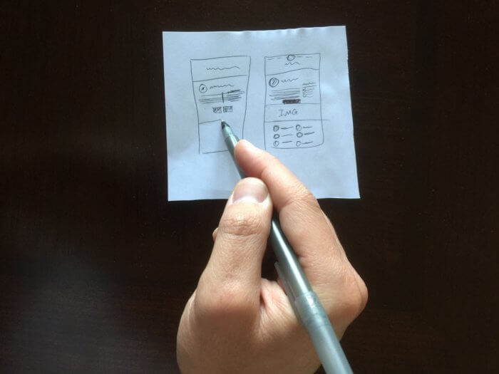
Now that you have all of the pieces you’ll need to build out your web pages, it’s time to find some inspiration and get to sketching some wireframe and layout ideas… by hand. Yes, I meant it when I said to draw these layouts.
Steven White (@sketchySteven) wrote in a codrops article, “By sketching, you can do rapid, almost train-of-thought development to get your ideas down quickly. It works on-the-fly, so you can spend less billable hours at the monitor and more time generating ideas.”
In other words, you don’t have to be Michelangelo; you just need to put your ideas to paper as fast as possible to have an effective creative brainstorm. If you hit a wall, try getting inspiration from sites like Crayon, siteInspire, Awwwards or even searching for web design in Pinterest.

Ingredient #3: Sketch
It’s time to build your pages in Sketch. I’m sure you’re thinking, “…wait, what about Photoshop?” Let me tell you right now that web design in Photoshop is dead.
Read more about how Photoshop for web design isn’t just outdated… it’s bad practice
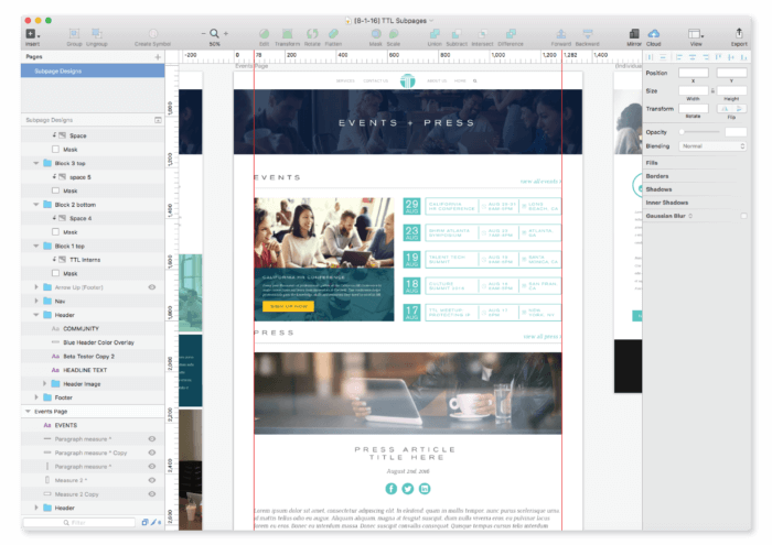
So what’s Sketch? Sketch is a responsive-ready web design software that works pretty much like Adobe Illustrator. You can build multiple-page layouts inside one file, build vector shapes and icons on the spot, and even create CSS text styles. Did I mention that you can “copy the CSS styles for any element” in your document for your developer and if you want, you can see a real-time preview of your designs on your iPhone, iPad or web browser? It’s a completely developer-friendly software. Here’s where you can purchase Sketch, and here’s where you can learn how to use Sketch.
Web design is fun. It’s also a new thing you’ll need to learn how to tackle. As long as you remember to talk with your client and work with them to create a finalized style tile, sketching your wireframes and layouts on paper and to use Sketch to design and build your web pages.


