
If you design social media cover photos for your clients, you may have noticed that LinkedIn pulled the rug out from under you by changing the cover photo size. Don’t sweat it, I’ve got the full scoop on this overhaul and how to design for it. Plus, as an added bonus, you’ll get a free template to aid in designing your new cover photos with ease. What’s not to love about that? Let’s get you up to speed.
Quick Overview: What Happened In the 2017 Overhaul
If you want the tl;dr, LinkedIn made the move to design their layout incredibly similar to Facebook. Upon logging in, you’ll notice the new layout. To the left is your profile photo with your name, title and company information with some stats showing who’s viewed your profile and how many connections you have. In the middle is your “feed” – much like Facebook, showing posts from the most current to the least, and a window to share a post or write an article. To your right are ads, cleverly labeled “What you need to know now” which is the same spot Facebook displays ads. Finally, the nav bar got a user-friendly redesign with commonly-used links and titles.
Profiles and subpages also received an interface redesign to match the homepage. Overall, the design is clean, mimics Facebook to give users an easier experience and is less clunky than the old platform. The biggest change to us as designers? Cover photo layouts & photo sharing sizes.
“That’s the thing about LinkedIn. For years, it’s been the (gainfully employed) square at Social Media High. This redesign could win it a spot at the cool kids table. Sure, it dresses like Facebook, but it’s still a nerd at heart. That’s a powerful combination.” – Robbie Gonzalez, Wired (@Wired)
Have you seen the @LinkedIn interface #redesign? The biggest change to designers? Take a look: Click To Tweet
Adjusting to the New Layout and Sizes
Cover Photos: This is the most drastic change in my opinion. While they look pretty similar to the previous covers for individuals, they’re dramatically different for companies. Before, company cover photos were small rectangles. Now, they’re large-scale images that only show the middle portion of the image – and even that portion is covered a little by the profile information. It’s not much real estate to work with, and if you’re unfamiliar with the sizes and how it works, it can be incredibly painful to design in.
- Cover Photos for Individuals: 4000x1700px
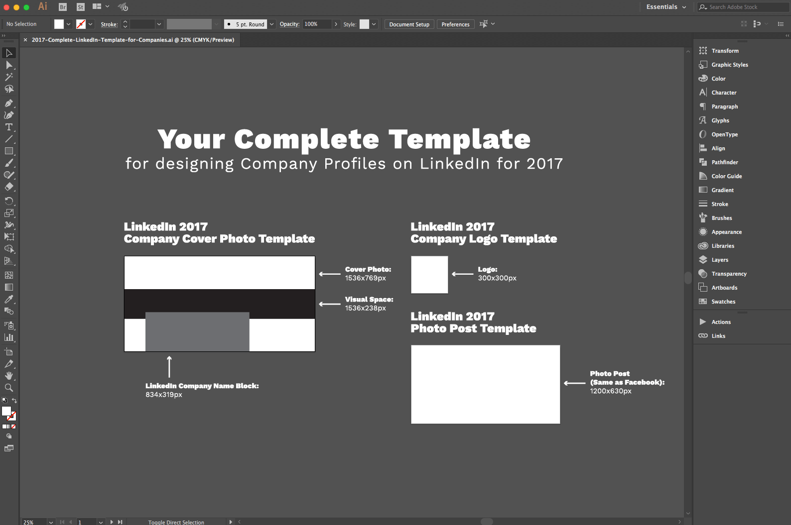
- Cover Photos for Companies: 1536x768px (only the middle portion shows, see last section)
Photo Posts: While you can still share square photos in a post, it will bring you 2 cons: LinkedIn now adds a gray background to fill in the rest of the width of the newsfeed (making your square photo into a horizontal image with an ugly gray background) and mobile will auto-crop it to a horizontal image, so it’s best to stick to this new size. The good news? This horizontal size is so similar to Facebook that you can now just design your client photo post images in 1 size and use them on 2 outlets – both Facebook AND LinkedIn. How awesome is that?
- Photo Post Size: 1200x630px
Company Logo Size: Horizontal is a thing of the past — it’s strictly square from now on. That means you’ll need to make sure you either upload your company’s rectangular logo to fit within a square or use the logomark within a square. Just note that the longer the company name/logo is, the smaller and less legible it will appear. I recommend using the company’s logomark so it can be displayed at a larger size for better brand recognition and to stand out more.
- Recommended Logo Size: 300x300px

Use These Company Templates to Lessen Your Burden
Okay, I know you’re overwhelmed with tons of new information. Chillax. Instead of trying to remember these sizes, you can download my Adobe Illustrator *template that has these sizes all laid out on artboards for you!
*NOTE: This template will download as a PDF, but it’s actually an editable Adobe Illustrator PDF. Just drag and drop it into Adobe Illustrator and it will open like a regular .ai file, no sweat.
Simply subscribe to our blog below and this incredibly easy-to-use template is yours.
Oops! We could not locate your form.
Here’s what the template looks like below. You’ll notice the labeled artboards sizes and a grouped shape graphic. The shape graphic is useful for visualizing what LinkedIn will display in the cover photo from the entire image so you can adjust your designs to fit in the space accordingly.
I use these templates every time I create new client imagery for LinkedIn, so I can personally guarantee your burden to be lessened. A good tip when using the template is to ungroup the shape graphic, then either turn the opacity down to 30-50% on the black bar and place it over your designs or use the black bar as a clipping mask to see how it will look behind the company name block.
 Want a #free #template to design for all of @LinkedIn’s new sizes? Get it here! Click To Tweet
Yeah, LinkedIn’s update could be a headache, but you don’t have to let it be. Simply bookmark this article for a quick reference to new sizes and what the new update includes. Don’t forget to download your free template either! I literally use this every time I make a fresh set of cover photos, so it’s legit. Be stress-free and enjoy the new update!

Related Posts
 6 Minute Read
Awesome Illustrator Tools to Use in 2023
10 Minute ReadHow to Make the Best InDesign eBook Template for Your Company
14 Minute Read