By Kyle Christensen:
Thinking about trying out a Facebook carousel ad to get some leads? It’s a great way to reach your target audiences and the scrolling format is totally different and unique compared to the traditional static ad. So, what separates the good carousel ads from the great? Don’t think of the Facebook carousel ad as 4-5 different ads. Instead, if you make them all work and flow together, you’ll have something even more powerful. That’s what Qdoba did. Read how they made an epic carousel ad in my next dissection, here!
Hey @Qdoba, your epic @Facebook carousel ad was praised and dissected by @RedBranch's design lead, @KyleJCDesign — check it out & send him a burrito! #GraphicDesign #Marketing Click To Tweet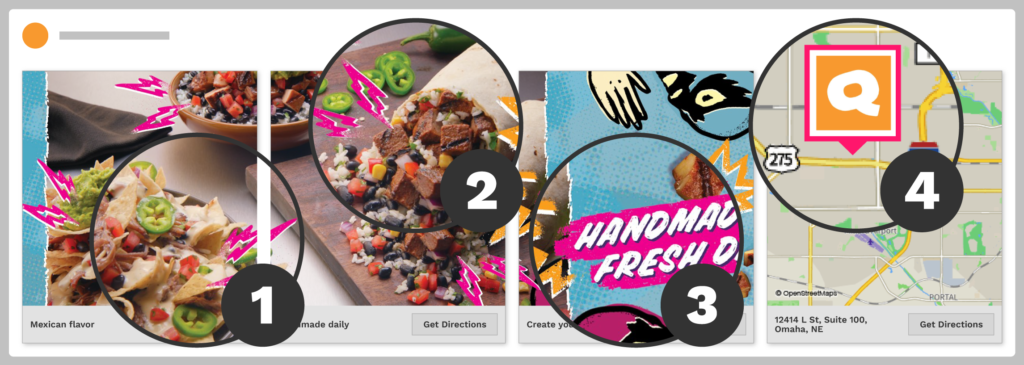
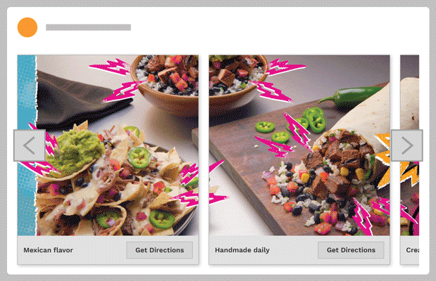
 Success #1: Overlapping Ad Graphics
 Success #1: Overlapping Ad Graphics
How do you get a user to actually view a Facebook carousel ad in its entirety? They’re usually a few frames long, which makes the user have to manually scroll through each frame. Sure, you could make a few different ads, but it might just end up being content overload for the user.
Qdoba solves this problem by visually leading the user from one frame to the other by using overlapping graphics. Not only do they overlap to encourage the user to follow the first half of the graphic to the other half of the graphic on the next frame, but they also chose a bright color to make sure it catches the user’s attention. Genius!
Success #2: Showcasing Colorful Ingredients
 Success #2: Showcasing Colorful Ingredients
Qdoba isn’t wasting any of their ad space. Sure, they could show a high-res photo of a burrito because that’s what they’re famous for. It’s real and looks exactly how it will when ordered, but when a user sees a giant blob of pale tan, it probably won’t be appealing enough to get any clicks.
Now slice open that burrito and showcase all of the colorful, tasty ingredients and it’s a different story. Not only did Qdoba showcase a fresh-looking burrito, but they strategically chose a menu item which displays a palette of warm and inviting colors to make the user feel welcomed and more enticed to buy. That’s how you showcase food, my friends.
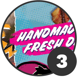
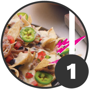
Success #3: Bright, Message-Related Typography
To the untrained eye, one might gloss over these small details, but to a designer, they’re brilliant. If you’ve noticed throughout the carousel ad frames, Qdoba uses bright pink lightning bolts to highlight and frame in their ingredients. Once you get to the 3rd frame, you’ll notice the background behind the subheader text is also pink which ties into the copy that says, “Handmade Fresh Daily!”.
The pink lightning bolts are referencing that all of their menu items are indeed, “handmade fresh daily”. What makes this 3rd frame even more successful is the typography itself and the luchadors are both presented in a hand-drawn graphic style which further reinforces Qdoba’s message of being “fresh” and “handmade.”
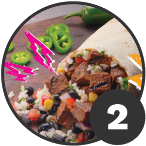
Success #4: A Geolocated Call-to-Action
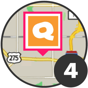 Success #4: A Geolocated Call-to-Action
After being successfully enticed to purchase a burrito, Qdoba adds the convenience of a geolocated call-to-action so the user can feed their craving. That’s a big deal. They could have simply placed a link to their website which says “find your nearest Qdoba,” but it would make the user have to do the work themselves and runs the risk of the user deciding not to get a burrito and keep on Facebooking instead.
Geolocation gives the user a map they can click into, use and go to the storefront. Not only any Qdoba but one that’s closest to them so they can get their burrito quicker. In an instant-gratification culture we live in today, it’s exactly what users need and what will be in my opinion, the best way to get users to actually get up and go purchase one.
In @RedBranch's next #DesignDissection article, @KyleJCDesign explains how @Qdoba made an effective, epic Facebook carousel ad. Check it out! Click To TweetOverall Rating: A+
Overall, the overlapping graphics, warm and inviting ingredients, bright, message-related typography and geolocated call-to-action makes this Facebook carousel ad an A+. There’s nothing in this ad I would change, and that’s what makes it epic. What I personally love about this ad is every frame not only leads to the next but it all ties together with the use of strategic imagery and bright graphics which catches the user’s attention and relates to the messaging.
What makes this ad over-the-top is the fact Qdoba places a geolocated call-to-action at the end, so the user can go grab a burrito at their nearest Qdoba location, and if they don’t know how to get there, the button on the last frame takes them to a map they can use. If you’re thinking about making your own Facebook carousel ad, I’d take some notes from Qdoba.
Check out My Other Design Dissections:
- Design Dissection: The Genius 2017 “Halo Top” Giveaway Email
- Design Dissection: Lyft’s Brilliant Landing Page Design

Related Posts

 8 Minute Read
Roomba Says: “Empty the Bin”
7 Minute Read2024: Resetting the Post-Pandemic Business Compass
13 Minute Read