Did you know social media design is beginning to change? According to a recent article published on the Buffer blog titled, “Why, I Think Social Media Is For Branding and Engagement, Not Traffic or Revenue,” it’s changing right now.
This means your clients will need to share different imagery to reflect the ever-changing medium of social media. That’s where I come in. Keep reading to get all of the tips you’ll need to make the perfect imagery for your clients so they can still make an impact on their audiences.
#SocialMedia is changing, & #designed imagery that businesses post will need to adjust: Share on XAre you new to designing imagery for social media? Check out this article to get you up to speed! BONUS: We’ve got links to FREE tools!

Engaging & Interactive Feel-Good Imagery
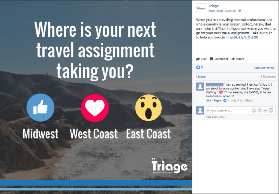
The future is engagement. According to the same Buffer blog article, it explains that “Engagement is also about the content you create and share across social platforms. Is it entertaining, useful or unique? Does it encourage your audience to respond? Or is it just there to drive clicks back to your website?” You can achieve this by creating imagery that encourages audiences to interact and engage. This can be imagery that asks people to interact with posts by clicking buttons such as “reactions” on Facebook, “like” or “retweet” on Twitter and “like,” “comment” or “share” on LinkedIn. Do this by asking people to interact with something relatable and clicking one of the different like buttons to share their opinion. A great example of this is a post from an Omaha medical staffing firm named Triage, which asks their audience where their next travel assignment is. It’s relatable to the people who like the page and invites them to interact with the post.
Quick Tips:
- Keep content in the image relatable to the audience
- Encourage users to interact with “reactions,” “liking,” “sharing,” or “commenting” on the image
- Make the image simple so it’s read fast & easily
- Stay away from promotional company things, and make it more about the user
Looking to create imagery that gets more likes rather than engagement? Check out THIS article.

Trendy Hashtags
Another thing to consider is encouraging audiences to interact by using your hashtags. There are different kinds of hashtags you can encourage your audience to use, though. According to the article, “5 Valuable Hashtag Marketing Strategies Proven to Engage Audiences” from Keyhole there are 5 different hashtags. There are “Brand Hashtags” which are “…Unique to your business…” and “…Encourage followers to use it as well…,” “Trending Hashtags” which uses current hashtags that are trending on the social media platform, “Chat Hashtags” which you can “…discuss a topic with users who are interested…,” “Content-Reflecting Hashtags” which use “…simply tagged words that relate to a posts’ content.,” and “Call-to-Action Hashtags” which will “…Encourage the online community to perform a specific action involving your brand.”
After you’ve selected the type of hashtag you’d like to integrate into your imagery, make sure you follow these quick tips when designing. It’s important to note to emphasize the hashtag in the imagery. Also, avoid things that might make your audience scroll past your post such as promotional things. For example, check out the image from CyberGrants above. It relates to their brand but engages the audience using a trending and relevant hashtag while the image utilizes a trendy design style.
Quick Tips:
- Keep the image simple & engaging, making the hashtag easily readable
- Try making imagery that utilizes current design trends, but making sure not to overshadow the hashtag
- Make the imagery fun and relatable to the audience & your brand but being sure to emphasize its relatability

Using Designed Videos or Going LIVE to Reach Audiences
Since engagement is the key to the new era of social media and social media design, another good idea is push designed videos and going live. An amazing way to do this comes from the article, “6 Ways to Use Facebook Live Video for Your Business” posted on Social Media Examiner which suggests to “Answer FAQs” which could “…identify a common question that your customer service team receives, and rather than answer the question again and again, you can have a Facebook Live video session to answer it. When you’re finished, you’ll have a video archive that you can share…” You can also take that one step further by making a quick designed video instead so you can post it throughout all of your social media platforms. Doing so will help make the video look more attractive and encourage people to watch it and share it at their own leisure.
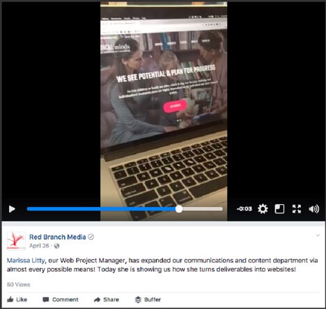
Don’t let FAQs be the only thing you make into videos though. Try other things like sharing helpful tips that your audience could apply to their daily lives, participating in trending challenges (remember the Ice Bucket Challenge?), sharing behind-the-scenes looks into your office or company outings or making a fun montage of your team’s company culture. A great example of an engaging video comes from our video we posted of Marissa Litty, showing an inside look into one of her recent projects here at Red Branch Media.
Quick Tips:
- Try to make the video no longer than 30-90 seconds
- Try different videos – FAQs, behind the scenes, how-to videos etc.
- Try making designed videos with motion graphics and trendy design
- Try going live or using Instagram to publish videos to social media
- Avoid promotional content, and focus on the viewer experience and making sure to make it as relatable, engaging and exciting as possible
Videos are some of the most powerful things on the internet today. See how you can make videos that turbo-charge your business, here!
Change is good, and it’s also inevitable. Embrace it and move your company forward by changing your posts to beautifully designed and engaging imagery that invites the audience to interact. Make sure to design imagery that also invites the audience to join in with your company using trendy hashtags. Don’t forget to try all the different types of videos, and most importantly, make sure your content is relevant, simple, fun and avoids anything that would make the user scroll away such as promotional content.


