We are halfway through the year and 2017 graphic design trends are beginning to cement. With the tide settling, it is the perfect time for a business to take the plunge and develop a real design strategy. According to a recent Adobe blog, design-driven companies have outperformed the S&P Index by 219% over 10 years. With successful companies like Nike and Apple boasting designers at the executive level, the importance of design to a company is indisputable. Content is king in our industry. But if that content does not look approachable, you can bet it will never see the light of day.
Read up on 2017’s most crucial 3 Graphic #Design Trends in the #B2B Market: Share on XIf you want to give your business a chance, paint a picture that cannot go unnoticed. Introduce the world to a brand that tells them what you are and why. Most times you get one chance to get the message across. Here are three trends that can ensure your audience is captivated.

-
Color it.
BOLD. CAPTIVATING. LOUD.
There was a time and place for softer, muted tones, but those times have since past. Companies today can no longer afford to keep quiet. To follow current graphic design trends, their brand must shout success in order to be heard. Strong, vibrant colors can help them do just that.
The goal here is to be memorable. When someone sees your brand it should be an undeniable fact that they are looking at you.
Red Branch Media is red, white and black. We use some accent colors, but our core colors are well defined. Our website explicitly tells our customers who we are and what we look like. Homogenous branding and marketing efforts not only make it easier for the company but also the people that are hoping to buy products or services from said company.
Instagram is frequently referenced in talks of colorful brand overhauls. Though met with much criticism on the outset, the various products of the company are now more succinct and help strengthen their brand identity. Any icons with this distinctive color transition will remind the customer that Instagram owns these products. Using bolder colors is important, but equally important is being consistent with your use of color.

Note: You do not have to rebrand your company to spice things up. Just consider some social media posts with more color, new signage or update old proposal forms. Test the waters and see what garners the most positive results. Adobe’s color wheel tool is an exceptionally viable place to start. Following color theory, you can find a quick palette by clicking and dragging the colors you want on the color wheel. Try it out!

What to remember: Be brave with the colors you use. Choose a color pallette that catches the eye and makes the customer think of you.
-
Move it.
GIFs and Cinemagraphs
In 2015, Twitter cited more than 100 million GIFs having been shared. GIFs are a staple in internet culture. Having been around for years memorializing movie scenes, quotes and failures, they have developed into the perfect medium to make unforgettable content. Do not hesitate to make those images POP!
Visual content has never been more competitive. Most businesses are aware of the power of captivating visual stimuli. In a study surveying more than 5,000 marketers, Social Media Examiner found that 37% of them believed the visual content to be the most important form of content, just one percentage behind blogs. As they say, a picture is worth 1,000 words.

The more information that can be presented visually, the more likely it is for your customers to engage with your company.
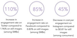
Microsoft did a study on their social media platforms. Over eight days, the company posted a series of static images and cinemagraphs targeting small and medium businesses and consumers.
The difference in engagement is astounding and a testament to what can happen when a company adapts to the mediums of the times. Don’t be left behind. Follow graphic design trends that affect your business! They are sure to yield great results.
What to remember: If you can make your content move, don’t hesitate. Customers don’t prefer working through text, but they won’t think twice about chasing images across a screen.
-
Make it.
Hand Drawn and Original Imaging

With automation on a high-rise and companies churning out millions of visual assets, one of the most surefire ways to differentiate yourself is to create original content. This hits several current graphic design trends in the market today.
Authenticity is a prized commodity among the public. With constant accusations of fake news and ingredients in store-bought food, people are hard pressed to find products and services that are real. The same goes for your digital impression on other businesses.
Ways to Achieve Authenticity:
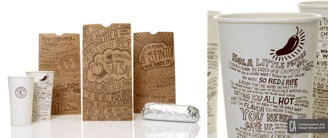
- Hand drawn art is a simple way to ensure your designs are your own. Filling your brand with iconography and text that is self-created can only mean that you get to point toward this content to show who you are.
- Customize your fonts! Many companies, even smaller companies, can hire graphic designers to create a company font or do it themselves.
- Combine the two and try your hand at some calligraphic typography. It isn’t as easy as uploading doodling or adopting a new font, but adding that artistic touch to your messaging can distinguish yourself amongst the outrageous amount regurgitated content out there.
- Take your own photos. Capture pictures of employees, your office, the environment literally outside of your office, anything! The more you steer clear of stock photography, the better. Dodging resemblance to other digital images with stock content can only last so long. If a prospect sees a duplicate picture once, it can severely affect their opinion of what you are capable of. Using company photos is an effortless way to, again, ensure that our designs are your own.

What to remember: True differentiation comes out of creation. Don’t just become different. MAKE yourself different.
Knowing the trends is half the battle. Check out our top 2017 Design articles over at Design 101 to really equip yourself to get cookin’!


