Beautiful, branded content is the dream, and having existing templates to make such content makes it easy! InDesign templates make it easy to have gorgeous and unified branded content quickly. But where do you start? All it takes to begin is inspiration and a few tips to build an InDesign ebook template seamlessly.
Adobe’s InDesign tool is perfect for creating captivating eBook templates for your design team. Here’s a quick guide on getting started and perfecting your team’s branded content:
Setting Up Your InDesign eBook Template File
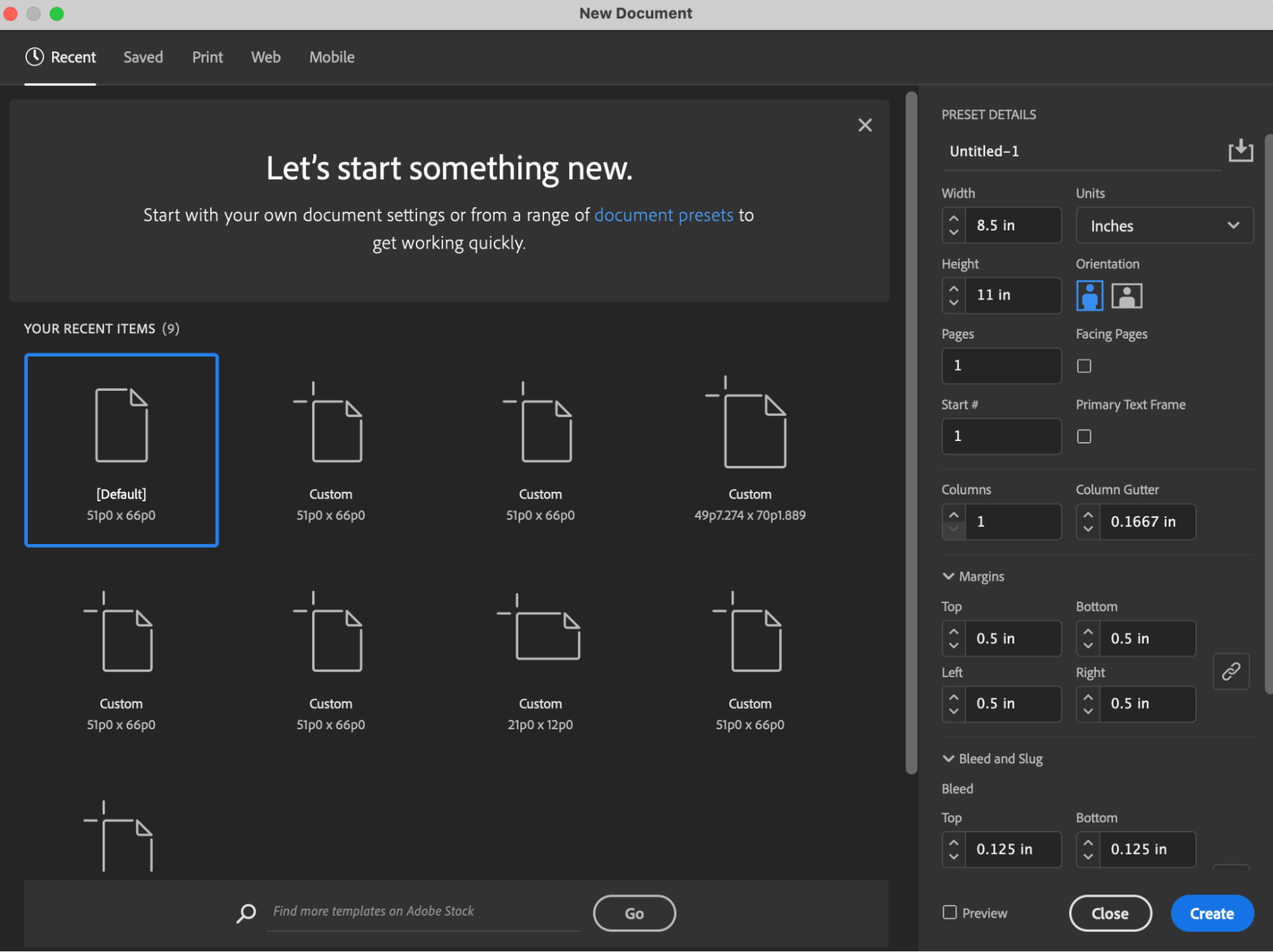
Begin the process by opening Adobe InDesign and clicking on the button ‘’New File’’ on the top, left of your page. Select your design size by selecting “Inches” from the “Units” menu, setting the orientation to vertical. I recommend using the standard 8.5×11” paper size, and you can do so by typing in 8.5 in the width field, and 11 in the height field.
Next, I suggest setting up bleeds now in case of future printing.
A best practice here is 0.125 inches, so insert that figure in the bleeds section.
For margins, use the default 0.5”.
Quick Tip: It’s also important to uncheck the facing page’s checkbox. Having this checkbox checked will show two pages instead of individually, which can get confusing. See the example below.
 Similar Content: Design 101: 5 Tricks All Designers Should Know To Make Life Easier
How to Create an Effective Cover Page
It’s the tone for the entire ebook, so don’t skimp here.
Your InDesign ebook template cover page should contain the following:
- A sharp, vectorized logo
- A captivating headline
- Subheadline
- A likable yet straightforward image or illustration
The text hierarchy is clear. Your headline should be the largest font size and the most concise text. Three lines maximum will make it easily digestible by the viewer. The subheadline text should be smaller, but the message can be longer. This section acts as a brief introduction. The cover page should be easy to read, simple yet elevated, and truthful to the client’s branding. It can also contain graphic elements, such as shapes used in the existing brand book or brand-colored elements.

How to Set Up a Master Page
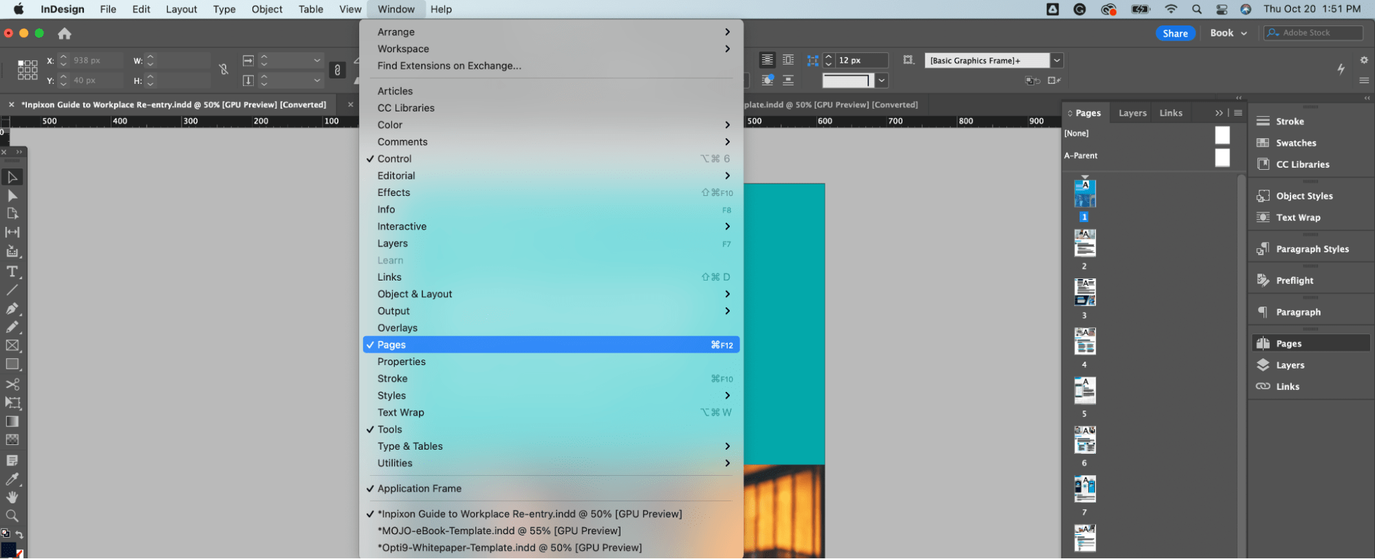
Start by setting up your Master Page with a footer, page numbers, etc. It helps elevate the look of the ebook and ensures uniformity throughout by starting here! To set up a master page, select
‘’Window’’ >’’ Pages’’ > and “A-parent” once the pages on the right side menu open.
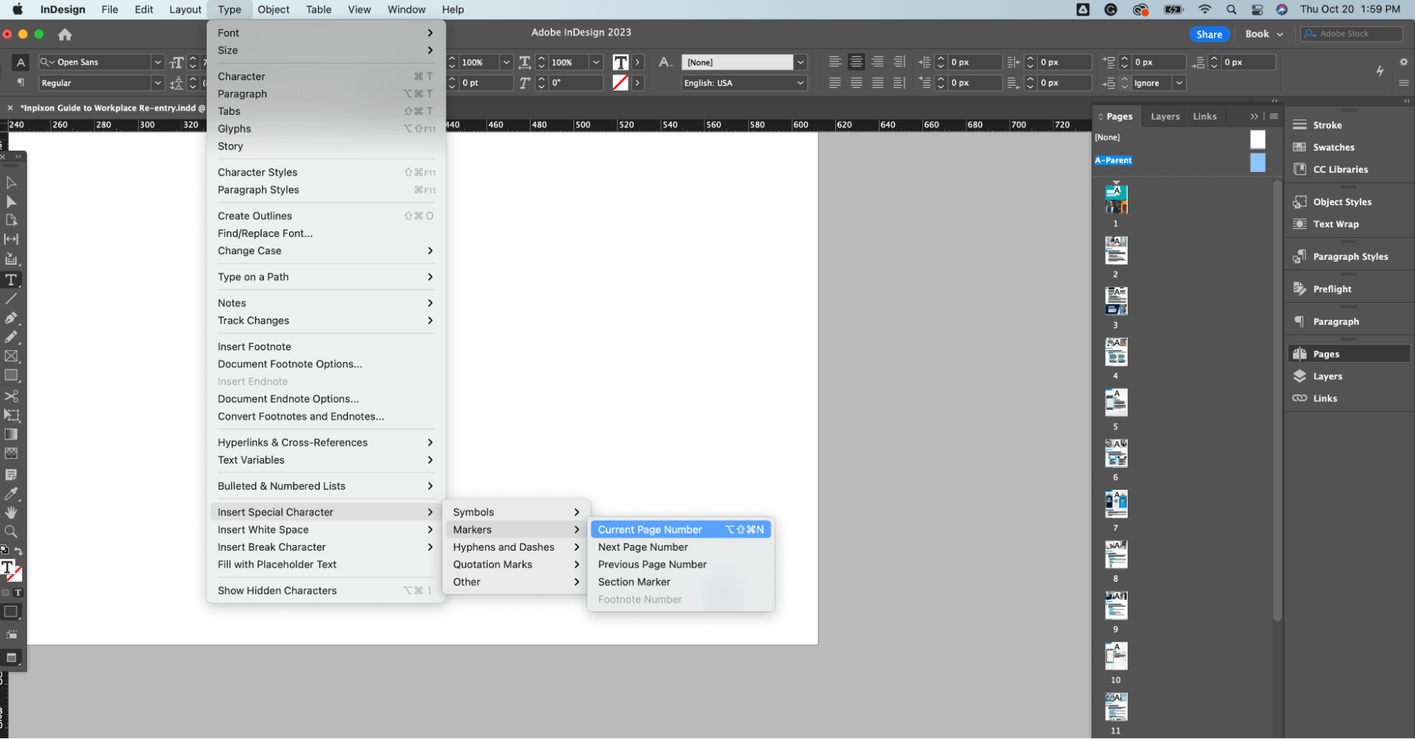
To insert page numbers, start with the menu bar at the top and select the ‘Type” option.
Select ‘’Insert Special Character’’ >’’ Markers’’ >’’ Current Page Number’’.
Click on it in the “Pages” menu on the right, then drag it to the page to be applied.
You can create multiple master page layouts if needed, but I recommend sticking with just one for consistency.
Quick Tip: Don’t forget to link the icons you use to the appropriate destinations, such as the company logo, to the company website.

Need a Laugh? 12 Hilarious GIFs That All Graphic Designers Can Relate To
Creating Different Layouts
Table of Contents
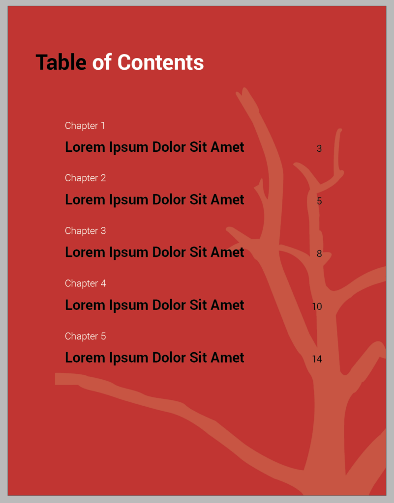
After you set up your cover page, you can create a table of contents that includes all the title pages, followed by the current page numbers. A good table of contents should list all front, main, and back matter, including the headings and page numbers of all chapters, including the bibliography. I recommend completing it last, so you aren’t repeatedly changing it as you design or risk a change not being recorded.
A Good Table of Contents Example:
Chapter/Title Pages
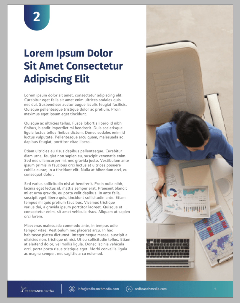
Your table of contents should be followed by the chapter or title pages. A good chapter page contains the title of the chapter on a header image, but you can use some graphic elements as a page header, followed by a purposeful illustration. The title page should also include a body copy: usually an introduction to the eBook.
A Good Chapter/Title Page Example:
Multiple Layouts
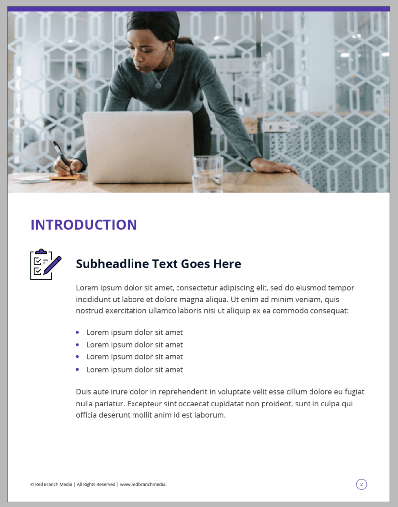
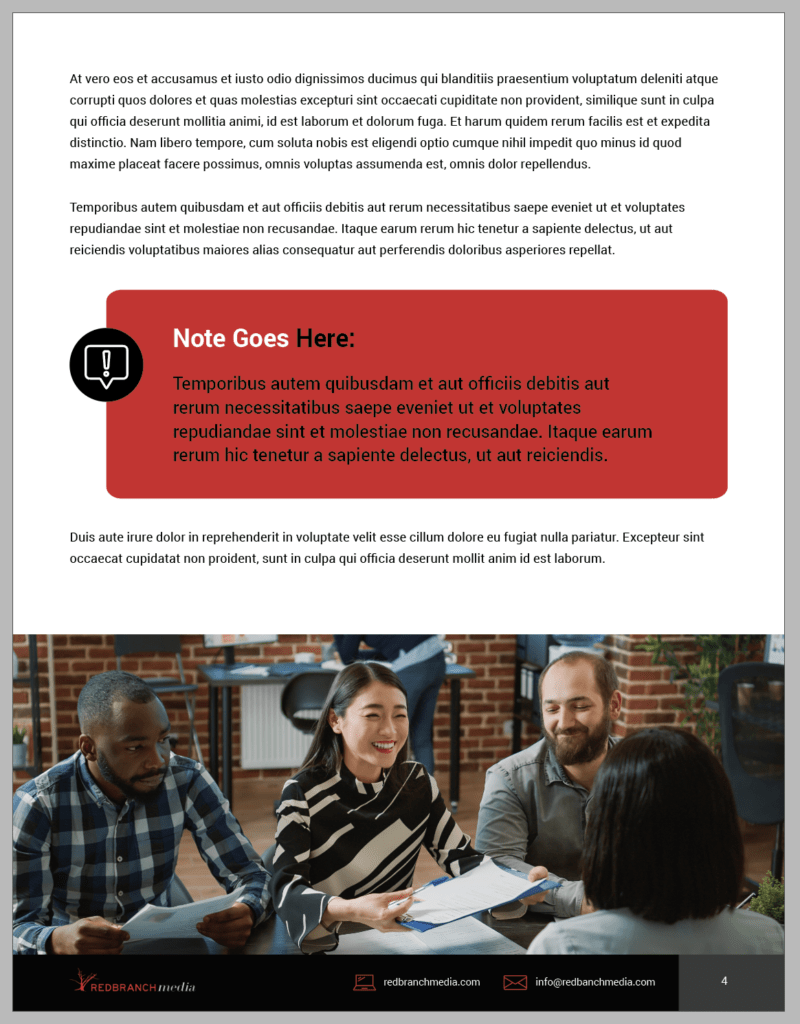
Body copy pages can show various layouts to create some texture and intrigue, which is more likely to keep the reader engaged. However, it’s best to keep the layout designs to 4 or fewer to avoid your template looking chaotic. An easy way to break up the copy and switch up the layout is with well-placed images or illustrations that help tell the story of the text. Depending on the copy, you can also play with the font sizes by creating different subheadings or pulling quotes and one-liners to highlight.
Good Layout Examples:
End CTA Page
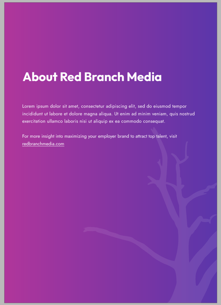
Wrap up your InDesign eBook template with a dedicated CTA page. The acronym ‘’CTA’’ stands for Call to Action and is an instruction to the visitor to encourage them to explore the next steps of your sales funnel. A Call to Action might be simple instructional text, such as “find out more,” “check out our website’’, or “schedule a demo today”!
A Good CTA Page Example:
Wondering Where to Spend? Check Out: Which Graphic Design Trends Should My Business Invest In
What Your Finished eBook Should Look Like
A finished eBook should contain the following:
- A cover page
- Table of contents
- Chapter pages with multiple layouts
- An end CTA page
The chapter pages should also have a nice footer, which usually contains the logo of the company, contact information ( email, phone number, etc.), and the page number.
Quick tip: All contact information should be hyperlinked and clickable for the targeted audience to reach the company’s website or email address only with one click!
How to Package Your eBook to Share with Your Team
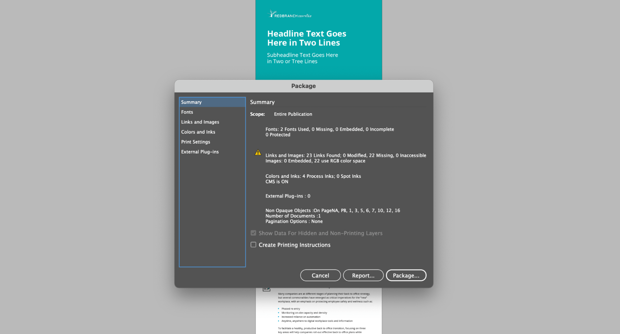
Woohoo! You’re ready to share your eBook with your team! Before sharing, you’ll want to package your file and can do so by going to:
‘’File’’ >’’ Package’’
Be sure to confirm now that all linked files are accounted for, note how many fonts are used, how many images are embedded, and how many elements are using RGB color space. On the right menu bar, you can also find the fonts, linked images and links, colors and inks, print settings, and external plug-ins.
Once complete, your InDesign file will create a folder of your eBook and all assets to go with it. To share this with your team, click on the packaged folder, right-click, and create a zip file by clicking on “compress.” You can now easily share the zip file with your team!
 Having an existing eBook template will not only make your content look sleek and professional, but it will also help your team to create content even faster. This way, you can bring in more leads to your company by offering eBook promos, building a resource library on your company website, and offering eBook downloads to an email list or social post. By following these steps, you’ll have a great eBook template that’s sure to perform well!
Looking for more tricks of the trade? Subscribe to the Red Branch Media blog!


