We’re back with another logo creation from the Red Branch Media vault! This time, we are sharing our experience of designing a logo for an executive recruiting firm based in Malibu, California called August Venture Talent, or AVT for short. While primarily an “executive search firm for key leadership hires,” AVT also provides assistance to “early-stage startups with non-executive hires.” This company is known for being “…born out of passion and vision,” so we wanted to bring the same passion and vision into our logo design. Keep reading for the full story!
Check out our logo live on the AVT website, here!

What They Wanted
AVT is a small firm with powerful capabilities. They came to us wanting a logo and new website to showcase their groundbreaking company that strives to “…disrupt the status quo and changes the world.” Inspired by seeing the incredible love they have for their work, we wanted to carry that same passion and vision into their logo design. Here are some key highlights of what they wanted and liked:
- Incorporating some fonts that are sleek and angular
- Incorporating multiple circles with multicolor strands
- Trying a few versions stylizing the acronym, “AVT”
- Trying a few versions including the full company name, “August Venture Talent”
- Using a pastel-based color palette mainly composed of cool colors
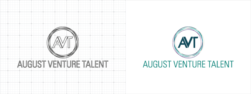
After multiple rounds of edits and feedback, the client was able to select and finalize their logo. Here is what we created:
Here's a #logo from the @RedBranch vault in @KyleJCDesign’s article featuring @AugustVenture! Share on X
What We Created
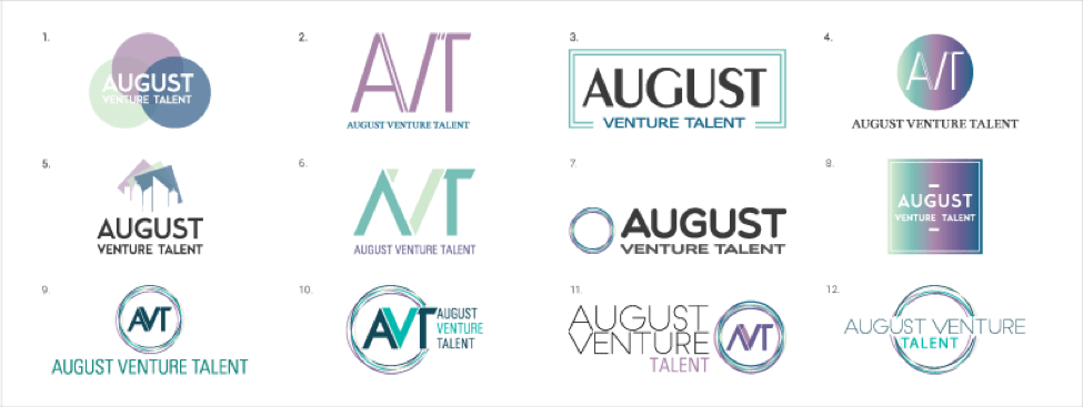
From the information we gathered from AVT, we were able to design an exciting collection of logos. Above is the full collection from all 3 rounds of logo boards and edits. We made sure to touch on their initial core requests by incorporating cool pastel colors, various versions using both “August Venture Talent” and the acronym “AVT,” experimenting with circles and multicolor strands and using some sleek and angular fonts. In addition, we tried 2 other approaches to the logo by trying gradients, squares and a minimal skyline (found in logo #5).
Design #Tip: When creating a logo board, it’s always good to include multiple versions of each #logo. Share on X
Their Decision
AVT chose logo #9 from the board above. This logo was one of our favorites because not only does it hit each key point from their initial ideas, but it also has an added versatility to it. The “AVT” and multiple strand circles can stand alone and still have the same powerful effect as the full logo. What’s more is that we added a contemporary touch to the letters “AVT” by putting them close together and slicing the “T” so it works well with the seamless angled space of the “A” and the “V” next to each other. All in all, it’s definitely a logo that captures the power, passion, skills and vision of AVT.
We couldn’t be more thrilled with the positive reaction AVT had when we finalized their logo. This success is what we live to bring our clients as designers at Red Branch Media. Did you know? Every time we make a logo, we always ensure the whole design team is a part of the initial first round of logos. That’s because each of us has a unique style and because of that, it benefits the client by giving them an even wider array of logos to choose from and make edits to.
#DYK? When making a logo at @RedBranch, the whole design team is involved for max creative diversity. Share on XSubscribe to our newsletter and watch your inbox to get your next logo rebrand story, straight to your inbox! We’re showcasing our best and most stunning logos each month, so you don’t want to miss out.
Curious to see our other logo rebrands from the RBM vault? Check them out here:


