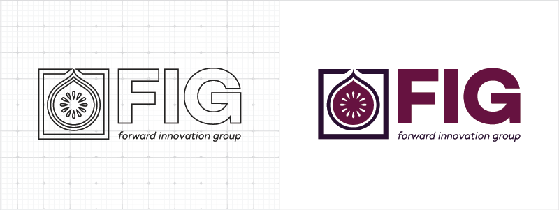
Every designer has logos that never see the light of day. We’re dedicating our latest blog post to those logos. The first logo we’ve pulled from our vault is rebranding the government agency known as Forward Innovation Group (or FIG). FIG came to Red Branch with high hopes and a great vision for their agency. We worked with them to deliver the final logo you see above. It wasn’t a quick project, which is why we have a strict logo process in place here at Red Branch to ensure quality results for our clients. Here’s how we did it!
How exactly does the @redbranch design team help clients nail down what they want? Find out: Click To TweetWhat They Wanted
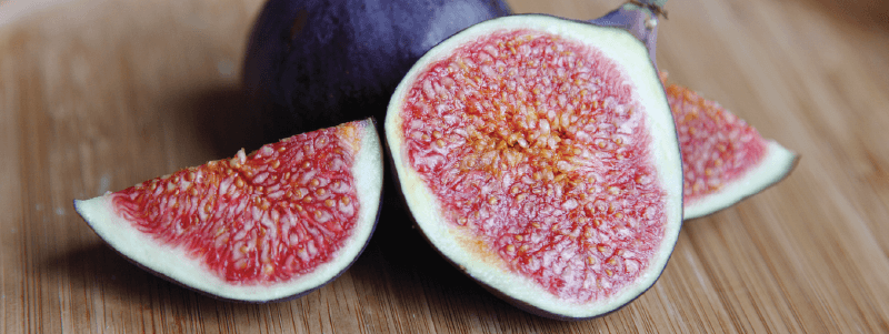 We took a call with FIG to nail down exactly what they wanted. Wanting their acronym “FIG” to be most apparent, while still showing their full name in the logo was a must. To incorporate this, we brainstormed in advance and concluded the best way to make this happen would be to place it under the logotype so it appears as a tagline. They also specified they needed to incorporate the color purple and the shape of an actual fig fruit. Being a government agency that makes bold choices and works hard for their clients, we had all the necessary ingredients to craft some great logos.
What We Created
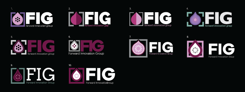
After we gathered all the information we needed, Kristine & I hit the ground running. We each came up with an equal amount of logos and placed them on one logo board for the client. With the idea of “FIG” being the focus, we placed a designed a fig icon in a box to represent that with this agency (FIG), you’ll get targeted results based on your needs. We also wanted to represent FIG’s boldness, so we chose a modern sans serif bold font, which paired well with the logomark. To tie it all together, we incorporated various shades of purple and made most of the taglines in italics to represent the “forward innovation” this agency brings to their clients.
Curious to see the best (and absolute worst) logo redesigns of big companies? See the infographic here!
Their Decision
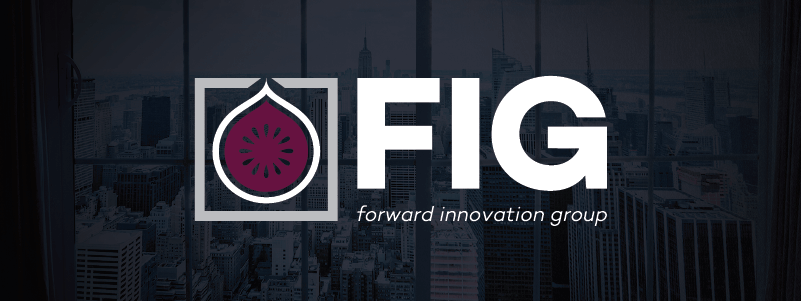
FIG chose logo #7 from the logo board and gave us minor tweaks for feedback. Here’s what we did: updated the colors to show a deeper purple, cut out the seeds from the fig shape, added space between the inside shape of the fig and the white stroke around it and touched the entire logo to be pixel perfect. They also wanted to display the logo mainly on dark backgrounds, so in addition to finalizing logo #7, we made an alternative full-color version (as you can see from the beginning of this article) so their logo could be placed on light backgrounds too. Above, you’ll see the finished logo against the branding of their website (imagery with a dark overlay and soft vignette) we created here at Red Branch Media.
Did you know logos and graphic design are only 1/2 of the company’s brand? Check out the other side of branding with Maren’s article, “Employer Branding for the Dirty, the Ugly and the Downright Boring.”
This project was an awesome experience, and the first logo we’ve ever made for a government agency. We’re glad that FIG loved their logo, and we couldn’t be happier with the end result: A bold logo that shows the modern, bold edge FIG applies to the work they bring their clients. Did you love reading about this rebrand? Don’t sweat, subscribe to our newsletter and you’ll be the first to get the next featured logo article straight to your inbox!

Related Posts
 6 Minute Read
Awesome Illustrator Tools to Use in 2023
10 Minute ReadHow to Make the Best InDesign eBook Template for Your Company
14 Minute Read