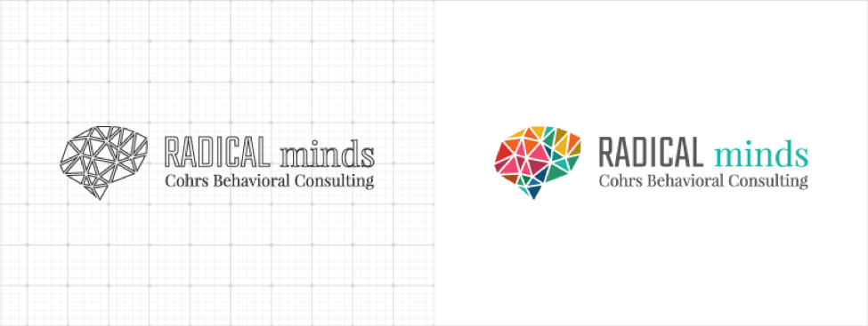
It’s a new month, and along with it it’s time for another glimpse into the Red Branch Media logo design vault. Today, you’ll get to see how we crafted a logo for a local Omaha-based behavioral consultancy firm called, “Radical Minds.” When they came to us, they were just beginning their journey as Radical Minds within their also new business, Cohrs Behavioral Consulting. Both organizations would need branding and messaging, which gave us an opportunity to create a new approach to logos. Both would need to work together well while holding their own when seen alone. Our collaborative effort with their leadership led us to creating a more traditional logo design for Radical Minds and logotype-based logo for Cohrs Behavioral Consulting. Check out how it all came together here!
Check out our logo live on the Radical Minds website, here!

What They Wanted
Radical Minds is a dedicated team of experts and professionals who strive to create fulfilling and full lives for those living with behavioral health challenges and autism spectrum disorders. They serve families and individuals of all ages. Since they were just beginning their 2 new businesses, they relied on us to get the job done of creating 2 unique, but also complimentary logos. Here are the key highlights of what they wanted in their logo design:
For the Radical Minds Logo:
- Hipster design style
- Bold lettering
- Clean, crisp, easily recognizable but a little more sophisticated
- Creative, unique and possess stand-alone potential
- Try incorporating some versions with a serif font
- Try incorporating some versions that represent the Phrenology chart of the brain
- No color preference
For the Cohrs Behavioral Consulting Logo:
- More professional and traditional
- Possibly use a serif font
- Color preference: gray
The logo process went incredibly smooth. We were able to build off of logos round by round until a final logo was chosen. After the client selected a logo in the 3rd round, we were able to finalize it and ship the official files. Here’s how we executed it.
Check out the featured #logo from the @RedBranch vault in @KyleJCDesign’s new #design101 article! Share on X
What We Created
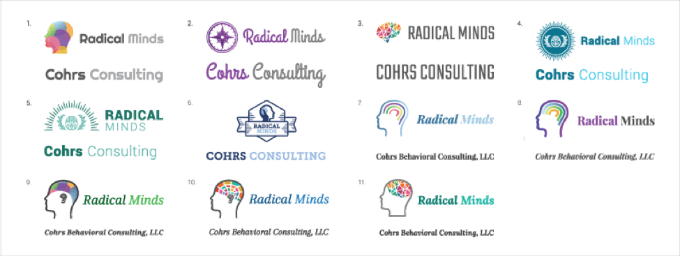
Since we had a lot of room to play with for logo design, we made sure to try out multiple hipster design trends for logos. We also tried meshing a hipster design style with a Phrenology chart to make sure we give them as many options as possible to choose from. Since we didn’t have color restriction, we tried a few trendy color combinations such as grays and brighter or cool colors, as well as using a rainbow of bright colors (a relatively newer design trend) to represent Radical Minds helping all people. Finally, we incorporated bold fonts in both serif and sans serif, as well as a cursive and slab serif font to provide a few extra alternatives.
#Tip: When designing a #logo create both abstract & concrete logos that represent the client. Share on X
Their Decision
The team at Radical Minds chose logo #3 from the logos above and #7 for Cohrs Behavioral Consulting. What was unique about these logos, is that not only could they be used as stand-alone logos, they could be combined to show both companies as a whole. We did this by making Cohrs Behavioral Consulting appear as a tagline in the Radical Minds logo and using the same font from “minds” for Cohrs so they would be harmonious. Not only was this an awesome idea, the final combined logo hit all the points on their wish list. It merged a bold sans serif font with a traditional serif font, had hipster design style qualities, was clean and crisp yet easily recognizable by presenting a wide array of bright colors in the geometric brain and incorporated a gray so the Cohrs Behavioral Consulting logo could be used as a stand-alone if needed.
At @RedBranch, we ensure that you will get a #logo to represent your company, and LOVE it too! Share on XFrom the initial call, to the progressive rounds of logo boards, the client reached a logo they loved. We were so honored to be a part of the very beginning of Radical Minds’ journey, and even more honored that they chose us to make it happen. Glad you love the new logo, Radical Minds! Loved reading this story?
Subscribe to our newsletter and watch your inbox to get your next logo rebrand story, straight to your inbox! We’re showcasing our best and most stunning logos each month, so you don’t want to miss out.
Curious to see our other logo rebrands from the RBM vault? Check them out here:


