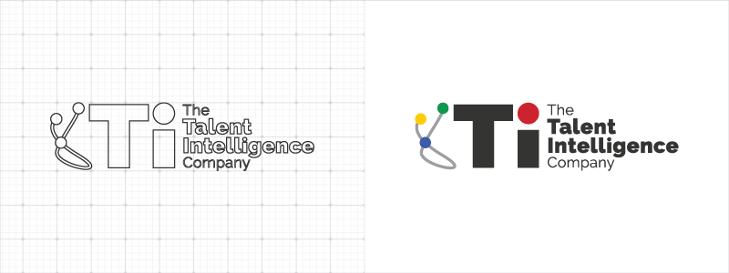
Your favorite agency is back with another logo from the Red Branch Media vault! In this edition, you’ll see how we rebranded a logo for a global brand called Talent Intelligence. Talent Intelligence is “…a global leadership risk management company that solves its clients’ critical talent challenges through the integration of external talent intelligence in the key areas of succession planning, talent pipelining and human capital intelligence.” Talent Intelligence came to us with the hopes of taking their old logo and making it better capture their brand and messaging. After careful planning and execution, we delivered the logo they were looking for. Check out how we did it!
Check out our logo live on their website, here!

What They Wanted
Being a global brand that works with many different people and regions, we wanted to gather as much information as possible so we could resonate with their clients on a universal scale. Here were the main things they needed to be incorporated into their logo:
- Keeping the 4 colored dots (yellow, red, blue and green) that symbolize their 4 core benefits/insights they offer their clients
- Making sure we use a dark gray color in the logotype
- Making sure we incorporate “TI” and “The Talent Intelligence Company” into the logotype
- Trying a few versions without their original string graphic that held together the dots, while still trying a few fresh takes using the string graphic
- Trying a few versions without a sans serif font
Since this project was mainly a logo refresh, we made sure to apply all of their notes and highlights above into the logo design. The final logo took about 3 rounds of logo boards to produce the logo they desired. Because they are a global client, we had to prep logos ahead of times since one of the members of their global leadership team is staffed in London.
Check out THIS featured logo from the RBM vault in @KyleJCDesign’s article, featuring @Talent_Intel! Share on X
What We Created
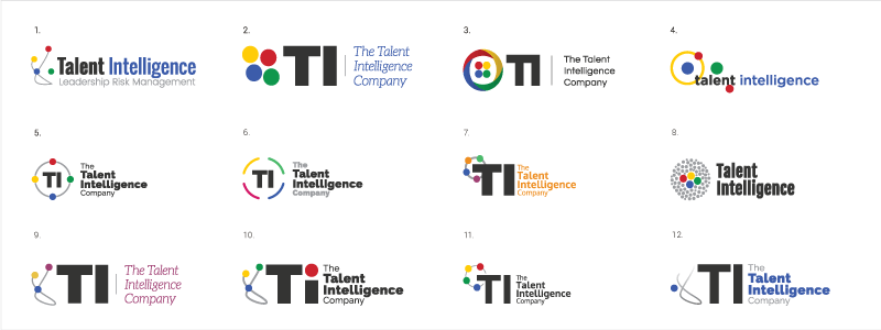
The additional information we made sure to collect on the logo refresh helped guide us to make the perfect set of logos. Above, you’ll see all of the different logos we created over the period of 3 logo boards (3 different rounds of bringing logos to the client and applying their feedback). While we hit all the key points in their initial request of using a dark gray font, trying both sans serif and serif fonts, incorporating “TI” and “The Talent Intelligence Company” and their 4 dots in most of the logos and trying a few versions with a reiterated string graphic, we presented a great variety of logos to be chosen from. We even tried a few new colors and experimented with changing the dots into a circular dashed outline as an alternative.
#Tip: It’s important to give #clients a variety of #logos to choose from when creating their logo. Share on X
Their Decision
Talent Intelligence chose logo #10 from the board above. We loved this logo because it was close to a literal refresh of their old logo, but with an added modern and timeless twist. What’s different is instead of having the red dot linger unattached to the string graphic, we replaced the dot of “TI” with the red dot so it would be better incorporated into the logo and have the appearance of a lowercase “i.” We also thickened the string graphic a bit so it wouldn’t get lost when the logo is decreased in size. Finally, we incorporated “The Talent Intelligence Company” but made sure to put an emphasis on “Talent Intelligence” to unify it with “TI” as it’s the literal translation of the acronym.
We’re happy that they enjoyed the end result. From planning, to gathering information and execution, this logo was a complete success. Our logo process is very thorough here at Red Branch, but because of that we always deliver quality results that resonate with our clients. We can’t wait to start our next logo and share the details, and we don’t want you to miss out!
Subscribe to our newsletter and watch your inbox to get your next logo rebrand story, straight to your inbox! We’re showcasing our best and most stunning logos each month, so you don’t want to miss out.
Curious to see our other logo rebrands from the RBM vault? Check them out here:


