By Guest Author: Lexie Lu:
A strong visual identity is one of the best tools available if you want to quickly communicate what your brand stands for and the kind of products it offers.
However, not every approach to graphic design is right for every business. Some may be outdated. Others may just not be a good fit for your particular brand.
These graphic design trends are some of the most popular right now. Each has something to offer every business, no matter what kind of audience you’re after or the values you want your design to embody.
1. Illustrations, Animation, and Motion Graphics
Many brands, when they need a graphic, reach for stock photos. These images are typically well-composed and do a decent enough job of communicating an idea. However, they’re not unique are won’t help you stand out from any other brand.
#Designtrends are not one-size-fit-all for company identities. Dive into recent trends on the @RedBranch blog and see which ones match your company values! Share on XIllustrations are one possible alternative. Replacing photos with them will give you more control over the emotions your designs communicate. They are especially effective for companies that want to lean into more playful or energetic branding, but any business can take advantage of illustrations to create a more distinct visual identity.
When designing for the web or digital media, animation and motion graphics can take illustration work even further. If you want something that adds movement and dynamism to your brand, animation is a great tool. Motion graphics are popular with brands and organizations that want to break down tough concepts and include graphs, charts, and data visualizations in their digital media materials.
2. Minimalism
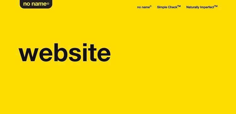
Always a popular option, minimalist design cuts out everything that’s not necessary. No Name, a Canadian line of generic-brand grocery and household products, offers a good example of extremely minimalist design.

The website’s jokey nature riffs on the design principles of No Name’s product branding and packaging — yellow background and black text that only tells you what is in a particular box or container. The site shows how no-frills design can be leveraged to create a strong brand identity, even if there’s not a lot going on visually.
No Name is an extreme example that shows how far you can push minimalism. However, one of the best parts about this trend is that you can adopt it partially without going all-in. Streamlining your site navigation, simplifying your color palette, or relying more on simple shapes and text can help any design. If you’ve struggled with a site that feels too noisy or cluttered for your brand, adopting some minimalist design practices can go a long way.
Minimalism can also help you show off decisions that may have been otherwise covered up by complex design. For example, there is a wide variety of sign materials you can choose from when creating your business signage. Minimalist design can make unique material choices stand out.
3. Video
This trend likely won’t work across your entire spectrum of marketing materials — but it can be extraordinarily valuable for your digital advertising design. Video is becoming a commonly used tool for brands that want to communicate their work’s human side.
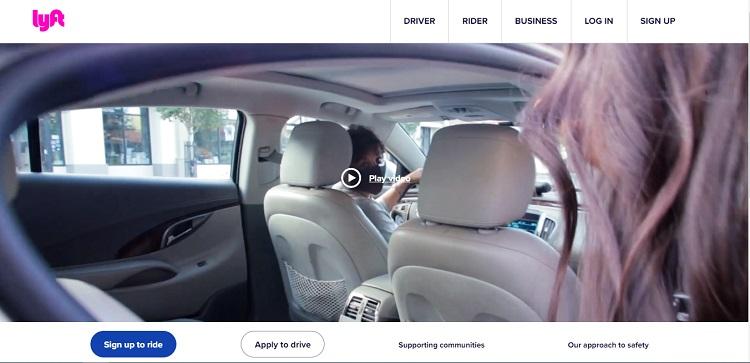
Lyft’s homepage is a great example of video in practice:

Video is front and center here. Lyft’s “Good Morning” ad ends with a description of the company’s LyftUp program, which provides free rides and resources to “help people reach food, essential jobs, and services.”
Even if a user doesn’t click, the element on the front of the page runs through the video’s main images — vignettes from the lives of people who work for Lyft or use its services. The rest of Lyft’s site uses video in a similar way. Animated .gifs serve as background for pages throughout the website, providing visual interest and communicating brand values.
Any brand can use video to show off a particular initiative or highlight a set of wins from the past few years.
4. Patterns and Textures
Minimalism isn’t right for every brand. Some companies want a cool and controlled look, and that kind of branding works well for a few different markets, such as high-power design companies, tech businesses, and B2B firms. However, it may not always be the feel or look you want.
Patterns and textures can add a lot of playfulness and interest to a brand’s designs. Even simple tweaks — like a paper grain or ink-wash texture, adding to the background or a few design elements on your site — can significantly change how your brand is perceived. If you want your company to feel hand-crafted, artsy, or down-to-earth, textures are a great way to get that feeling across.
Does your company boast #minimalism, or is a mix of patterns more your vibe? See which recent #designtrends make sense for your company on the @RedBranch blog! Share on X5. Earth Tones and Muted Palettes
Bright and vibrant may not be the right look for every business.
Earth tones, which incorporate browns and other natural colors, can communicate stability and a down-to-earth quality customers appreciate when the world feels chaotic.
Similarly, muted or dimmed palettes that don’t necessarily have to use these natural tones and colors are a bit less energetic and relaxed. If you want your brand to put customers at ease or emphasize how your offerings make life simpler or more convenient, dimmer palettes can be a big help.
Top Graphic Design Trends
The graphic design trends you use in your brand materials can greatly impact how audiences perceive your company. Investing in them can give you more control over the values and emotions your marketing communicates.
By Guest Author: Lexie Lu:
Lexie Lu is a web designer and UX content strategist. She enjoys covering topics related to UX design, web design, social media, and branding. Feel free to subscribe to her design blog, Design Roast, or follow her on Twitter @lexieludesigner.


