It’s said that a picture paints a thousand words. That’s probably one reason why charts, graphs and other visual data are used to help people understand information easier. If your data is not presented properly, then key understanding will get lost. This is why knowing how to create data that is both visually compelling and easy to understand is so important. Here are some steps to creating graphs that are compelling and attention grabbing.
Getting Started
Your data can be visualized in many different ways. When you first start creating graphs it is important to think about the story/message you are trying to get across. Knowing this information will help you pick what visual fits best. Start with looking over the data and finding patterns and connections.
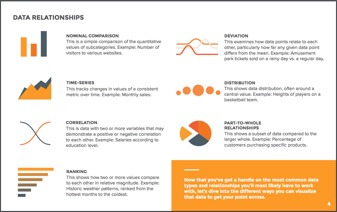
Before understanding the visual aspect of the graph, you must understand the types of data that can be visualized and their relationships to each other. The most common ones that you will encounter are quantitative, discrete, continuous and categorial. Quantitative is data that can be counted or measured; all values are numerical. Discrete is numerical data that have a finite number of possible values. An example of this would be the number of employees in the office. Continuous is data that is measured and has a value within a range. An example of this would be rainfall in a year. Lastly categorial is data that can be sorted according to group or category. An example of this would be types of products sold.
Look for resources that can help you with creating graphs. There are plenty out there to choose from by just searching on Google. Some that I would recommend are Pinterest and lynda.com.
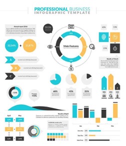
If you are stuck or just looking for inspiration, Pinterest is a great tool to use. Pinterest has generated more referral traffic for businesses than Google+, YouTube and LinkedIn combined. Whether you are looking for a certain style or design, they have thousands to search through. They show all the different types of graphs as well. This can help when figuring out which way to display your data, such as using a pie graph instead of a bar. Below is just a small example of the variety of graphs they have.
Lynda.com
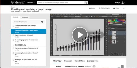
This site has videos that walk you through step by step. It is very helpful if you are a beginner on a certain design subject. This shows you the basics on how to create and apply graph design. It is a very informative site for any kind of design you want to learn about.
These are just a few sites to help get you started. There are plenty to choose from. Just start searching for the one that best fits you. Find out which sites work best for you in creating graphs.
How do you get started creating compelling graphs? Check out more in this #design 101 article! Share on X“Getting the design just right is difficult. And sometimes, the only way to “get it right” is to design a couple of different versions and consider which one best accomplishes your objectives in a truthful, yet compelling, way.” – Colleen Roller, Digital telepathy (@dtelepathy)
What Types of Graphs are There and When to Use Them
The next part is knowing what type of graph to use. The type of graph you use depends on the type of data. Remember to think about the different types of data discussed earlier, such as quantitative, discrete, continuous and categorical. These will help you decide what graph works best. Also, think about the amount of data you have. Bar graphs tend to look better with more data and pie graphs might look cramped with too much data. Find out what is the most important part of your data and make sure that is understood with the graph you pick.
Bar Graphs
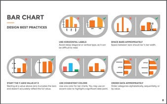
Bar graphs are very versatile. They are best used to show change over time, compare different categories, or compare parts of a whole. Vertical bar graphs are best used for chronological data. Horizontal bar graphs are best used for data that has long category labels. Stacked bar graphs are used to compare multiple part-to-whole relationships. These can be vertical or horizontal. Stacked are used when the total of each category is unimportant and the percentage distribution of subcategories is the main message.
Pie Graph
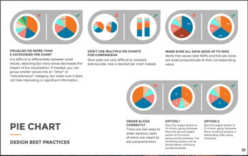
Pie graphs are best used for making part-to-whole comparisons with discrete or continuous data. They should be used for small sets of data. Pie graphs are one of the most popular types of graphs. However, some argue that they can be difficult to use and inaccurate unless using familiar percentages such as 25, 50, 75, 100. The donut style is becoming more popularly used. This type of pie graph has a circle cut out of the center of the pie graph in which you can add text, icons and more.
Line Graph
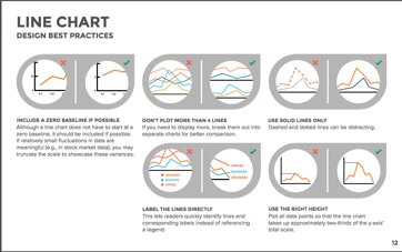
Line graphs are used to show time-series relationships with continuous data. They help show trend, acceleration, deceleration, and volatility. Line graphs do not need to start at zero but it should be included if possible. Use four or fewer lines, if you use more then put them into separate graphs.
Area Graph
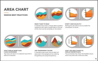
Area graphs depict a time-series relationship as well as line graphs. However, they are different than line graphs because they can represent volume. They are best used to show a quantitative progression over time. Stacked area graphs are used to visualize part-to-whole relationships.
Scatter Plot
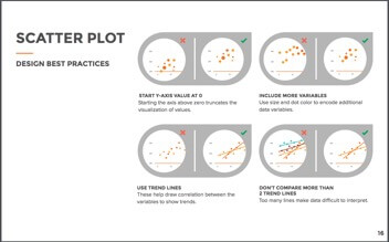
Scatter plots show the relationship between items based on two sets of variables. Creating graphs such as these are great to show the correlation in a large amount of data. Use size and color to encode additional data variables. Don’t use too many lines with the dots, it makes it difficult to interpret.
Bubble Graph
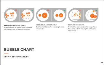
Bubble graphs are good for displaying nominal comparisons or ranking relationships. Bubble graphs can be used as bubble plots where they are combined with scatter plots. These are used to display an additional variable. They can also be used as bubble maps. This helps with visualizing values for specific geographic regions.
Heat Map
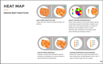
Heat maps are used to display categorical data, using color to represent values of geographic areas or data tables. Don’t make lines around the states distract from the graph itself. Using a lot of different colors gets distracting. Instead, use shades of one color to separate data.
 What types of #graphs are best to use? How and when should you use them? Check it out: Share on X
Why Use Graphs?
Graphs help people visually understand data. It simplifies data into compelling shapes, lines and patterns. This makes it not only easy to understand but eye catching for the viewer as well. Also, around 40% of people will respond better to visual information than plain text. Graphs will engage viewers more than reading information. A paragraph explaining data can become boring and repetitive. When using a graph the information comes alive to the viewer.
You now know how to create graphs and understand how to make them both visually compelling and easy to understand. Remember what types of graphs to use for certain data. Don’t forget to use Pinterest, Lynda or other tools you find to help get you started. These sites also help with the style and design for creating graphs as well. Use these steps to help create compelling graphs for your clients and your company as well.


