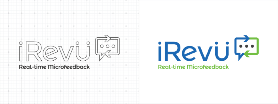
Another logo is born! From Washington DC, a company who offers a real-time performance feedback solution came to us for a website and logo refresh. In this edition of our logo vault series, you’ll see how we took their old logo, refreshed it and brought it to the next level (with a few logo design tips in between). Here’s the story!
Check out our logo live on the iRevü website, here!

What They Wanted
iRevü is an amazing product that lets employees and employers give feedback in a continuous real-time loop. The tool is used by big leagues such as Vector Talent Resources, NFL Players Association and National Lutheran Communities & Services. We took a call to kickoff this project and gather all of the information we needed to start the logo refresh. Here’s what we gathered.
Logo Design Tip: Don’t allow yourself to believe you know best because you’re the designer. Spend some time talking to the client. A logo should be a combination of design best practices (what you know) and the unique personality, values and mission of the company (what they know).
Logo Must-Haves:
- Keep blue & green as the main logo color
- Keep the old tagline, “Real-time Microfeedback”
- Use a sans-serif font style
- Refresh the old logo, but feel free to try something new
What We Created
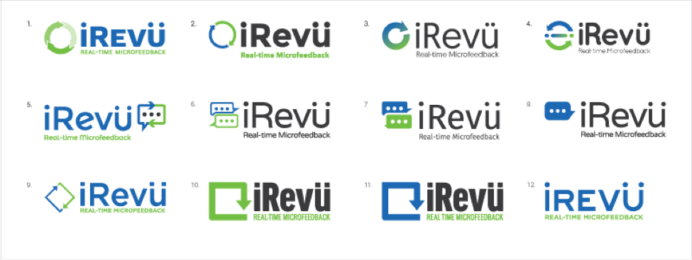
This logo was mostly a refresh-based project, though we had fun creating alternate versions. We made sure to incorporate all direction from our client to highlight blue and green for primary colors, using a sans serif font, adding in the same tagline and trying a few new approaches. We kept the old circular arrow from the old logo, but tweaked it in a few ways. We also added a gradient and used multiple trendy sans serif fonts, but stepped out of the box by trying a text prompt design as seen on mobile devices (since the product is real-time feedback application). The end result produced 3 rounds/boards of logos for our client to choose from and tweak.
Logo Design Tip: We use logo boards to get the client thinking about the look and feel they want from the final design. The first round has quite a few variations, but the second board is more refined. When we hit the third and final, there are only 2 or 3 similar iterations for the client to choose from.
#DYK the @Engagiant_irevu's logo was created by the @RedBranch team? See how the magic happened: Click To Tweet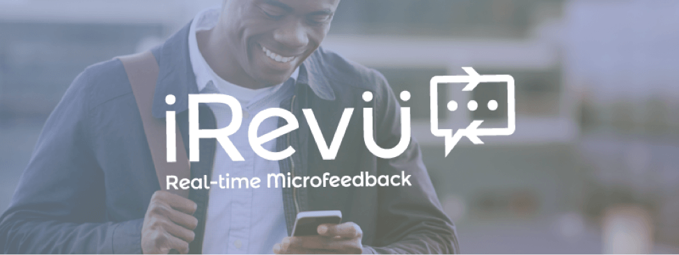
Their Decision
The team at iRevü chose logo #5 from the board above. They loved how we used the cycling arrows from the original logo and turned them into a typing text prompt. Another feature from this logo that hit the right chord with the iRevü team was the tilted “e” in the logotype for a unique touch. We’re happy they chose this logo as it’s timeless, trendy and communicates the product effectively as a real-time performance feedback loop application. One subtle thing we love about this logo is that the umlaut on the “u” of the logotype is placed over the arms of the “u” which gives the appearance of two people communicating.
See how we created for @Engagiant_irevu a logo perfectly tailored to their #brand & product. Click To TweetThe new logo for iRevü was an incredible success. We were honored to make it for them and we’re glad they love the design, as it’s a perfect representation of their brand. The timeless logo is now featured on the brand new site we created for them as well as on the product interface! Check iRevü out, try a demo and make sure to look for our next logo.
Subscribe to our newsletter and watch your inbox to get your next logo rebrand story, straight to your inbox! We’re showcasing our best and most stunning logos each month, so you don’t want to miss out.
Curious to see our other logo rebrands from the RBM vault? Check them out here:
- FIG – A Government Agency
- Windridge – A Consulting Firm
- Talent Intelligence – A Global Leadership Risk Management Company
- AVT – An Executive Recruiting Firm
- Radical Minds/Cohrs Consulting – An Omaha Behavioral Consulting Firm
- Talent Engine – A Talent Acquisition Sourcing Company

Related Posts
 8 Minute Read
Extra Credit Is Due to the Companies That Use This Value
10 Minute Read#NowPlaying: RBM’s Favorite One-Hit Wonders (& RBM’s Most Memorable Moments)
 9 Minute Read