
We made another logo design, and you’re going to love it. In this edition of Red Branch Media’s featured logo design from the vault, you’ll get to see how we developed a logo for a talent acquisition sourcing company called Talent Engine. This company has developed “futurecasting methodologies” at some of the big guys like Microsoft, Cisco, Amazon, Blizzard and Expedia (to name a few). With such an exciting client, we were eager to make them a logo that was perfect. Here is how we did exactly that!
Check out our logo live on the Talent Engine website, here!

What They Wanted
Talent Engine is a company of experts who help clients by “…supporting them in gathering prospect or candidate data from multiple channels and help compile and organize these data points into current, actionable records. They will even work within their client’s current talent acquisition system if they choose to do so and maintain and update valuable client data and find new candidates or prospects.” After getting direction from speaking with Talent Engine, we compiled their must-haves for the logo and got started. Here are the 3 main qualities they wanted:
Logo Design Must-Haves:
- Clean and simple design
- A logo that shows motion
- Possibly having a logo with a subtle graphic
What We Created
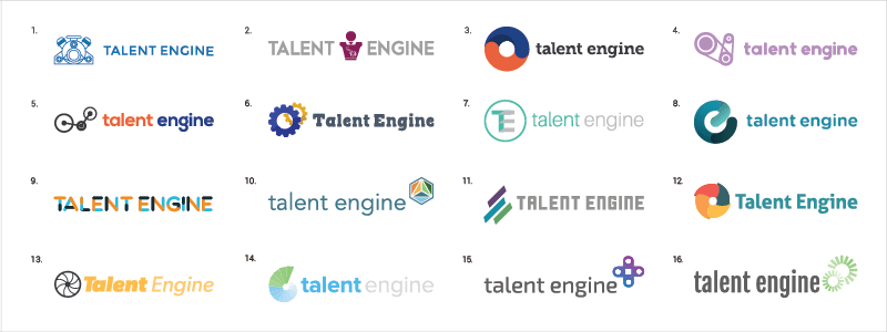
We wanted to give Talent Engine a vast collection of exciting logos, so following their guidelines we made about 16 different designs. We decided to go this route so the team at Talent Engine would be able to view their company name as a logo in multiple design styles. This initiative helped their team find a style they loved, as well as narrow down a logo that resonated with them. We even displayed the company name in all caps, sentence case and lowercase to add more variety. Deciding to go with this strategy, Talent Engine fell in love with the logo you see today.
#DYK, we created a #logo for a company who has worked with some big clients like @Cisco & @Amazon: Click To Tweet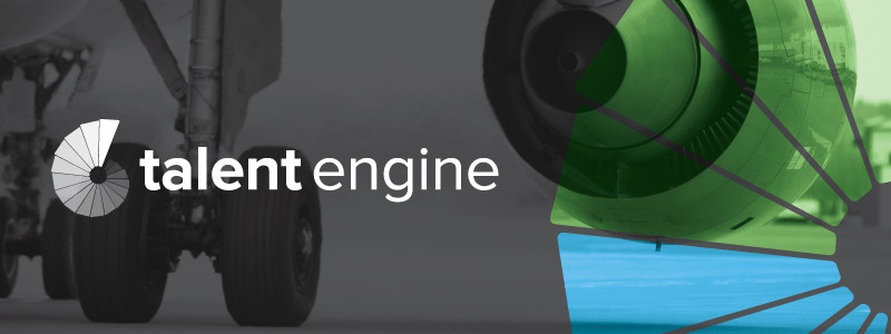
Their Decision
Talent Engine chose logo #14 from the board of logos above. One of the main things they loved about this logo was that the gradient circular bars reminded them of the operational assembly line they have. What’s more is that this logo has a timeless, yet clean and simple feel to it like they wanted originally. The power of this logo comes from the subtle contrast of font weights in “talent” and “engine” paired with the two-tone gradient circular bars that represent motion. The trendy factor that ties the logo all together is choosing to display the company name in all lowercase. All in all, this logo design was a complete success.
Our 3-round #process at @RedBranch ensures our clients have a phenomenal logo. #design Click To TweetWe’re thrilled to see another happy client, and we can’t wait to make many more logos in the future. From start to finish, our proven 3-round logo process that we’ve mentioned in our previous logo vault articles ensured a phenomenal logo that hits all the qualities the client wanted. We love the logo just as much you, Talent Engine! Enjoyed the story?
Subscribe to our newsletter and watch your inbox to get your next logo rebrand story, straight to your inbox! We’re showcasing our best and most stunning logos each month, so you don’t want to miss out.
Curious to see our other logo rebrands from the RBM vault? Check them out here:
- FIG – A Government Agency
- Windridge – A Consulting Firm
- Talent Intelligence – A Global Leadership Risk Management Company
- AVT – An Executive Recruiting Firm
- Radical Minds/Cohrs Consulting – An Omaha Behavioral Consulting Firm

Related Posts
 6 Minute Read
Awesome Illustrator Tools to Use in 2023
10 Minute ReadHow to Make the Best InDesign eBook Template for Your Company
14 Minute Read